
Searching for apps on the iTunes App Store just got a whole lot more fun, thanks to a totally revamped Chomp. We take a look at one of the iPhone’s most popular app search apps.
Apps have never been a problem for iPhone users, as far as quantity is concerned. However, finding the right app is a different matter. With literally thousands of applications out there, picking the right one can be a bit of a pain. Yes, there are Apple’s recommendations and the App Store’s own categories and lists, but going through these is often a dreary affair. Which is why apps like Chomp exist – to help you search for apps in a more interesting manner. Already one of the most popular app search apps around on both iPhone and Android, Chomp’s iPhone version has now been given a thorough makeover.
Although it still remains relatively light in byte terms (1.3 MB), Chomp now has an entirely new look. Launching the app straightaway shows you a search box at the top, with boxes linking you to free apps of the day, the top 100 apps, new apps, and apps on sale. You can click on each of these to see apps that Chomp’s search algorithm has placed under them (based on parameters such as rating, social network discussions, downloads, et al). However, what we really love is the fact that each time you start the app, you get to see the top ten app search terms that are trending on Chomp, showing you what the world is searching for in app terms.
The terms keep changing every time you use the app, adding a touch of freshness to the entire experience, providing a welcome change from the usual category crawling seen in most app search apps – you could see Facebook and Social Networks one time, Hot Girls (yes!) and Cricket on another. There is also a “surprise me” box clicking on which shows up apps selected a random – an appy equivalent of Google’s “I’m feeling lucky” search button, we think, but very welcome indeed. And another Google-y touch is the fact that recommended search terms start appearing even as you start typing in the search box. Not bad at all.

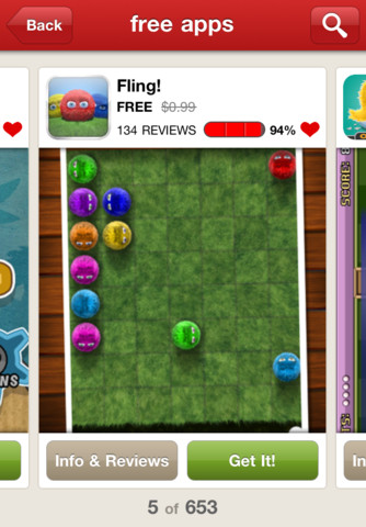
Apps are still shown as cards that you can flick from left to right, which is much better than scrolling through mainly text-dominated lists. Clicking on an app gives you access to comments and ratings about it as well as screenshots. And if you want to download it, you are directed to the app download page on the iTunes App Store.
All of which makes searching for apps – incidentally, the search results are still quite good – a whole lot more interesting than on the relatively staid App Store interface. And even better than Chomp’s own previously more predictive look and feel. Searching for apps is supposed to be fun. On the new Chomp, it is. Download, please.
Get it from: iTunes App Store
Price: Free