With some help, I managed to get a beta build of Windows Phone 7 Mango update running on my LG Optimus 7. Mango is said to be a significant update and the next wave of Windows Phones are expected to run this version (along with Nokia). When I originally reviewed Windows Phone 7, there were some shortcomings, Mango does work on that bit (NoDo also helped). To begin with, the Mango update, even in beta makes the phone fast and read fast. Navigation, switching apps, loading times etc all are significantly faster. The lag has disappeared and so is one of my biggest issues with WP7. And given the hardware we are running is old, this would only get better with new hardware and final built of the OS coming up.
For good or bad, I hadn’t had the opportunity to catch the original Microsoft announcement on Mango. So I am still exploring new features, am yet to stream official videos and see what else is in there so some of things like multitasking were discovered by holding down different keys and expecting some magic. While I haven’t used this for too long, here are some Mango flavors that are instantly visible.
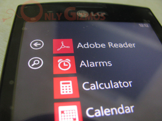
One of the most puzzling aspects of WP7 interface was the applications list. While the homepage is full of tiles, the apps page is a long list of app names with small icons next to them. With Mango update, you can see a search icon on the top left. This lets you search for apps within the list.
No universal search yet, pressing the dedicated search button on the phone still goes to the Bing search page, irritating as before. Guess the next-gen hardware would do away with the dedicated search button. The icon showing up for contacts search (image below) also seems to be newly added, I used the hardware search button for this before.
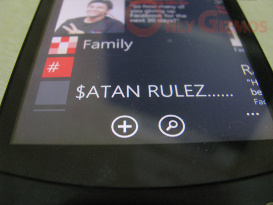
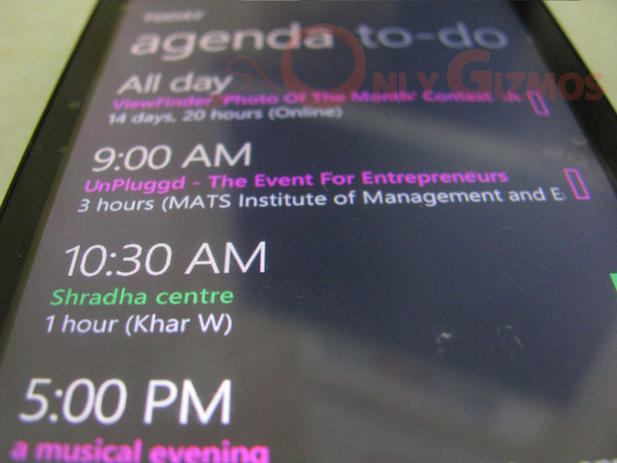
One of the awesomest things in Windows Phone 7 (Mango) is the Facebook events integration. The calendars app automatically syncs all Facebook events and throws it in the mix. Different coloring and event data imported within the app. Neat stuff!
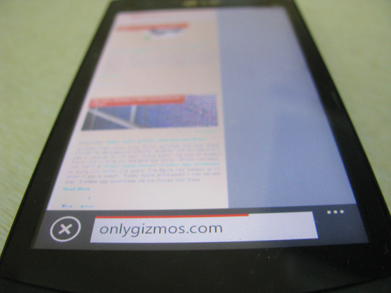
The image should say it all. We wonder why no one else thought of this before! The address bar on a smartphone, especially full touchscreen is best placed at the bottom. For the ones who aren’t clear, as we hold the phone from the bottom, it’s easier to get your thumb to press the address bar on the bottom of the screen, rather than finding it at the top of the screen. This adds to a number of UI tweaks across the OS. Here, are a few more.
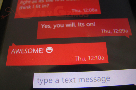
The changes are small, but highly visible. In the image above you would see that the outgoing text has a darker shade in the background. This image perhaps does injustice to the same, but it helps to see a much darker shade separate incoming and outgoing messages.
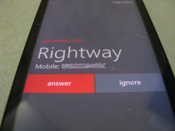
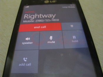
The large icons for an answer and ignore and overall feel of the calling screen are a plus, as well. I like it!

Another welcome feature is threaded emails. On, the front screen it tells you no of total messages and unread count in the thread. This bumps the utility of the integrated mail app. Yes, I still love those fonts and styling across the OS.
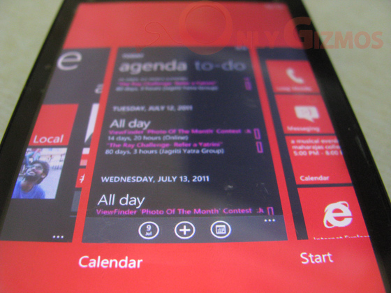
And of course, the multitasking. Not actually allowing you to jump between different apps remarkably freely, it lets you go back, upto 5 screens at a time. Again, welcome update. Have just discovered it a few hours back, but would like to see more on this. While this is good, it can be frustrating as well.
It’s unfair to mention, but had Windows Phone launched with this version last year or even early this year, it would have been at a different level today. Some of complaints today may be due to the horrible hardware on my LG Optimus 7 (viz wrongly pressing the hold button when on call, unresponsive buttons when on a call or answering / disconnecting a call etc), but there is a lot of work that has been done since the original update. The only thing I am missing here is some decent apps. For some reason even basic twitter/twitpic on WP7 is a pain for now!
Update: Another thing, Mango doesn’t seem to have helped the camera output. It still remains bad on our Optimus 7.
Tested on LG E900, OS Version: 7661.WP7_5_trial(mojobld).20110607-1657


Mango is wayyyyyyyyyyyyy better than ios and android!!!!
Mango is lightning fast and so is IE9 on my Focus which is older hardware, so imagine how it’s going to be on whats out now and whats getting ready to come out. Pretty much the only complaints I have about Mango so far (and remember its still beta) are no ability to close open tasks in the new task switcher, still can’t SMS a video, can’t take a screen shot, and no WIFI router. I think some of these complaints will be addressed before RTM. Other than that, its AWESOME. WP7.5 is going to turn the tide and in a couple of years, Microsoft will be king of the hill in the smartphone arena (again).
Annkur, if you want to get a detailed insight into all the features of Mango, have a read here:
http://pocketnow.com/windows-phone/the-ultimate-windows-phone-7-mango-preview
This way you can easily try these features for yourself. Some of them you won’t easily see, such as the alphabetic jump-list in the apps list which only appears when you have a lot of apps.
Context sensitive search exists in the NoDo version, but with Mango they have reverted back to the search button going to Bing, because they now have context search icons in the relevant screens instead.
Sure thanks