So, the BlackBerry Torch 9800 is finally out. And as with all tech products that are unveiled, the critics and supporters are out in force, the former calling it a dud and the latter the coolest thing since sliced bread. While we think that it would be a tad premature to draw conclusions (we have not seen or used the device yet), we certainly saw quite a bit that we liked – and did not like – in the RIM presentation yesterday. So, based purely on what we have seen and read so far, here is our take on the latest from the BlackBerry stable.
What we like:
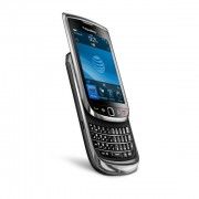
- The touchscreen-physical QWERTY keyboard combo. We honestly did not like the jiggly onscreen keyboards of the two Storm phones. The touchscreen with a slide out full-sized QWERTY seems perfect for those who want the best of both touch and keyboard worlds.
- The revamped browser (from which the device gets its name) is a HUGE step forward for RIM. With faster browsing and features like tabs, users will be less inclined to download Opera Mini within minutes of getting their BlackBerries.
- The fact that developers can now use HTML 5 and Java to make apps for the new OS is bound to shoot up the number of apps for the device. No, we do not expect it to overtake the Android Market or the App Store, but BlackBerry users will certainly have more apps to choose from. Best of all, all new apps developed for the new OS will work with older versions too (are you reading this, MS!).
- The Social Feeds app is something that we think could turn out to be a killer app. The BlackBerry range of devices is near perfect for social networking with its lovely keyboards and push notifications and Social Feeds could take it up to the next level.
What we do not like:
- No, we are honestly not too impressed with BlackBerry 6. It is a new operating system and is indeed more finger-friendly than its predecessors but honestly, there is nothing here that will convert users from other platforms, although the wireless sync is kinda cool. Core BlackBerry users will be delighted with the new features, but then, most of them are happy enough to potter around with 4.6!
- The 360 x 480 resolution is flatly disappointing in the era of the iPhone 4 (960 x 640) and Motorola Milestone (480 x 800), which have much higher resolutions. Whatever was RIM thinking of? While on the subject of the display, we were also disappointed by the size of the touchscreen. 3.2 inches is way behind the display sizes being trotted out by Apple, Motorola and Samsung.
- The 624MHz ARM-based processor seems a tad underpowered to us. No, we are not talking just in terms of megahertz here (we know they do not really matter – it’s the hardware integration that does) but the fact that the processor is the same that was used in the recently launched Bold 2. It served that phone well, but that had a smaller screen, no touchscreen, a less powerful camera and an older OS.
- Yes, we know that BlackBerry is not in the good-looking phone business but a device that looks like the Storm when shut and a bit like a large Palm Pre when open is not exactly the kind that people are going to flaunt, especially when the likes of Motorola and Samsung are upping the looks ante. Call us old-fashioned but we still think that RIM had got the design spot on with the macho Bold and has been floundering a bit ever since, trying to find its femme and general consumer side!

