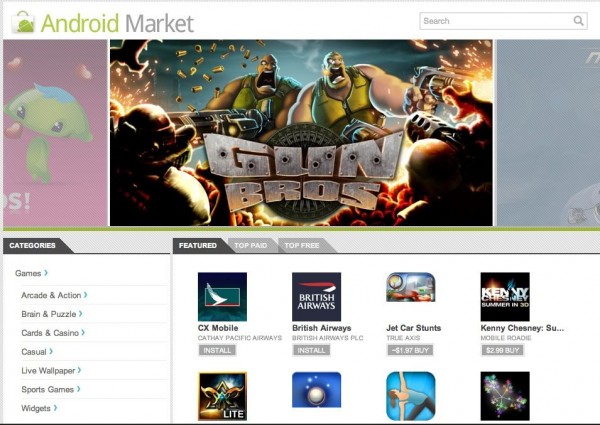
It was just yesterday that we published our Android app and I was pulling my hairs on the bad Android Market structure. And just 24 hours later, here comes the new Android Market Webstore announced at the Android event by Google. While the event covered a lot of Honeycomb, we are really excited to see http://market.android.com come up to give a web search for Android apps. The Android webstore has a pretty simple interface with features apps, categories etc being laid out in a very simple and lightweight structure. The App page shows you the ratings, features, updates for the app and also lets you seamlessly install the same to your phone from the browser itself (yes Over the air!)
Previously it was a headache to find an app on Android Market. If your phone isn’t compatible with the App in question, you just cant see it on the market (no notification of non compatibility either). The lack of visibility on Android.com gave markets like AppBrain a business model. All they did is to redirect you to the correct Android Market download link. I am certainly happy as a consumer aswell as a publisher on the market today! For social media lovers there is some social love out there in the market, you can tweet out your favourite app from the market (and anyone wonder about Facebook share?)
In the few minutes that I spent on the new market, I could see that the search can be further improved (or am I demanding too much?) Searching ‘onlygi’ gives me no result, forcing me to type the entire app name ‘onlygizmos’ to get to there. The same issue with other queries I tried. Rest, the new Android Market feels good. What do you feel about it?
One more thing: The navigation on the top of the Android market, makes us feel that Google would really really like this to be as accessible as a calendar or reader to Google users. iLike!


