With smartphones adaption rates always on the way up north, Google has been pretty strict about levying penalty to any website which does not perform well on mobile. The irony to the story is that Google Images, perhaps the second highest driver of traffic on Google, after the Web Results, is perhaps the least friendly service on mobile. The bland black borders and broken structures with terrible load times really kills the experience both on the Google Search app as well as the Google web page visited by the browser.

Google is well aware of the problem, and since April has been working on a redesign of its Image Search as well as Image View page on the app at least. As a part of the test, only a few users were able to see the new layout which is much neater and does away with the hideous black borders that the previous app had. The typography too looks a lot cleaner and well in sync with the Material Design language that Google has been propagating.
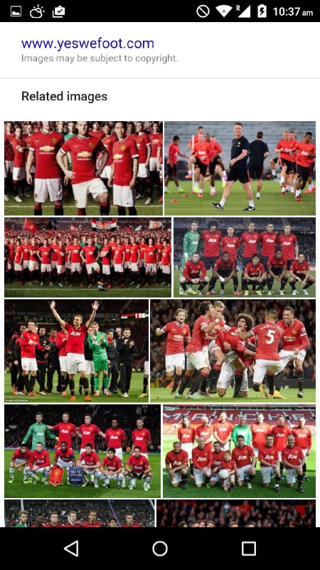
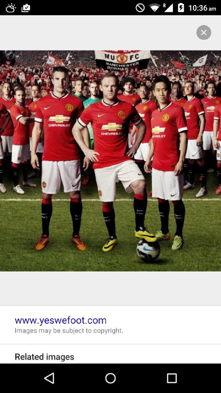
Comparison of the old image search on the left on iOS and on new image search on right running on Android Lollipop above.
Other than the obvious improvements to the UI, there is a feature addition too as right at the bottom of search, you will be able to see a section dedicated to Related Images which are basically images and topics that may be contextually relevant to the user based on his query. The new update specifically makes the transition from image search to image viewer section a bit less of a culture shock thanks to both the backgrounds now being largely similar. It is worth noting that the update is being rolled out in phases and while we were able to get the update on our OnePlus One, our iPhone 6 Plus was still stuck on the old Google Image search results page. So, if you are on an Android phone, make sure you have the Google app updated and chances are high that you will have the cleaner layout.
via: Android Police


