The latest Android Market update we tested yesterday, hit India today. This update brings new enhancements and a nice looking user interface to the Android Market application. So what’s in the package? Just find the details below!
- Market Main page: More Greener with iphone Album Art like interface. This page contains list of featured apps as well as other featured apps on top side which keeps auto rotating. Along with this it also has the usual buttons for Search, Apps, Games, and Downloads (Which is now renamed as My Apps).
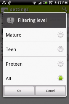
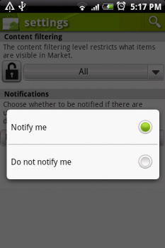
- Market Settings: Filtering and Notification Options. The settings page now has the option to filter what content is available in market. Filtering level can be set as Mature, Teen, Preteen or All. Other option available is Notifications, which allows the Market to automatically notify if there are updates to apps of games already installed on device are available.
- Apps and Games pages: They are usual with list of categories for applications, but the scrolling iphone album art like banner on top.
- Applications Page: Big Icons and Related apps. Bigger icons are now displayed for the app along with Install button on right and the description below. A ‘More’ button is also available to expand the details. Below the details are app screen shots and reviews. Below Reviews is a Related Apps section which present apps related to the app you are viewing.
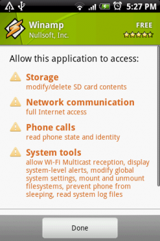
- Security Options: On App description page when you click menu, there is a new option available ‘Security’. Here you can see the details of what all the application has access to on your device. This works for both installed apps and apps you are viewing.
So go on, check these new feature updates on Android Market! and leave your comments about how you feel about this update!


hey Gaurav, how did u get those sceenshots? Which app have u used?
I just used the default DDMS application available with Android SDK.
So, the new market finally shows up for me today.
Congrats 🙂