Opera has been in the browser business since time immemorial now. While its much respected Opera Browser for them PC’s never quite took off, there are those dedicated Opera fans who would rather stop browsing the Internet than use another browser. Opera’s fortunes took a turn for the better after the arrival of the mobile Internet scene. Their Opera Mini browser has been on almost all kinds of mobile devices since the past decade or so and is still going strong. Its versatility, easy to use UI and the fact that it compresses data and actually saves the user money made it an all time favorite.
All that said, Opera seems to have decided to change with times. Which might be a good thing in the long run. How?
Enter Coast By Opera – a tablet specific browser that was released by the company last month. Currently supported only on Apple iPad’s (Mini included). Coast by Opera is an attempt to shake off the traditional norms you associate with web browsing and take intuitiveness to an all new level. The UI of Coast is claimed to be tailormade for the kind of usage a tablet user prefers. All this while, most mobile web browsers were basically shrinked versions of their desktop counterparts. Opera believes that is not the way forward and radically played around with the way you interact with a web browser on a tablet. Let’s see how well Opera has fared In its attempt to “be different”.
User Interface
Unlike the traditional browsers available on the iPad, there is a significant change in the user interface of this browser. It features a full screen format and supports both landscape and portrait browsing. Well, no surprises there!
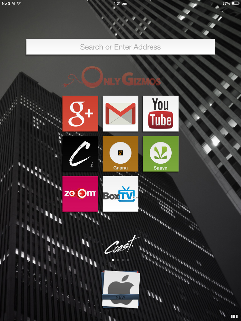
The Coast “homepage”.
Coast for iPad does not provide the usual Back and Forward buttons. Nor does it feature the address bar. Instead, whatever search term you wish to type in, or a website you wish to visit could be accessed by typing the text inside that prominent “search or enter address” box you see right in the middle.
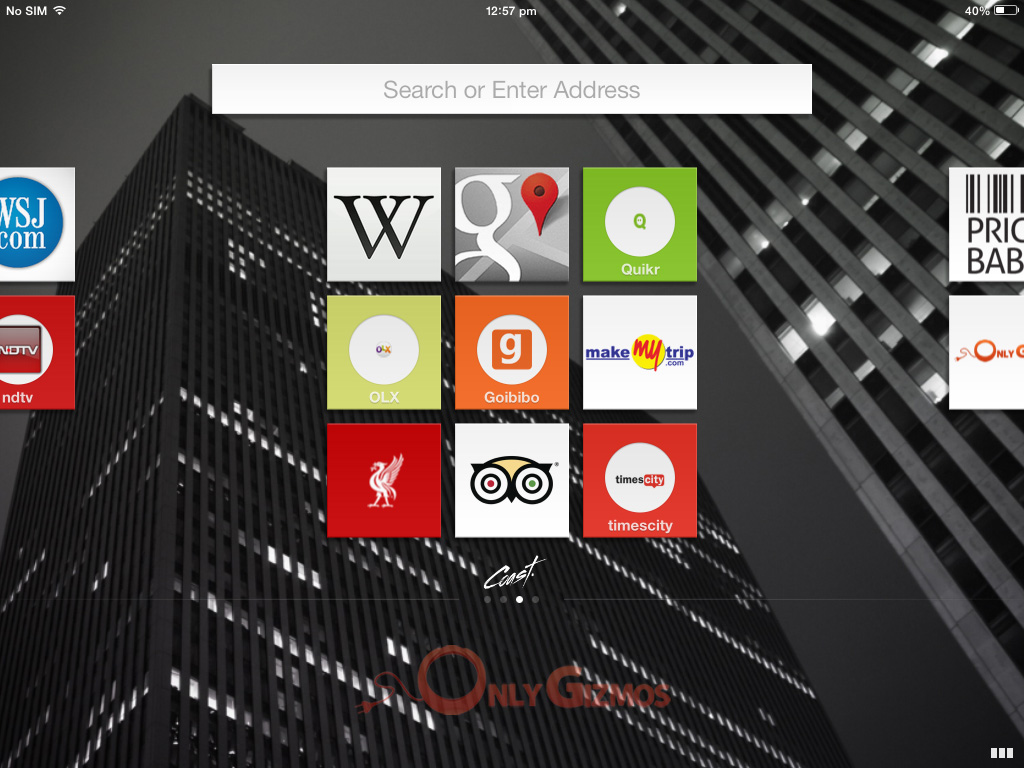
Coast displays saved websites like they are mobile applications/menu with icons. The saved websites/favourites are arranged as square icons in a 3 x 3 format with multiple menus for saving more favourite websites. The saved website can be arranged in an order of your choice by tapping and holding on the icon.

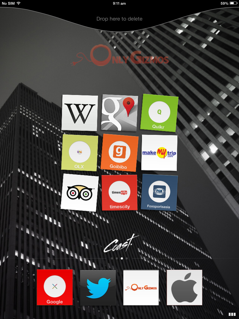
To delete a saved website, you can simply tap, hold and swipe it to the top.
Functionality and usage:
Tapping on the Coast icon, the Coast logo flashes while the browser is loading. If you switch back to Coast after using some other application, it will load the same page which you had last opened. In order to move back and forward, you have to just swipe your finger left and right respectively.

Transition to Previous page i.e. “Back”
When you tap a link on a page, the link gets highlighted and flashes indicating that the link is loading.
Tabbed browsing can be accessed by tapping the three squares on the bottom right hand side of the browser. The screen pulls in the current page and enables switching to whichever open website you’d like to browse on.
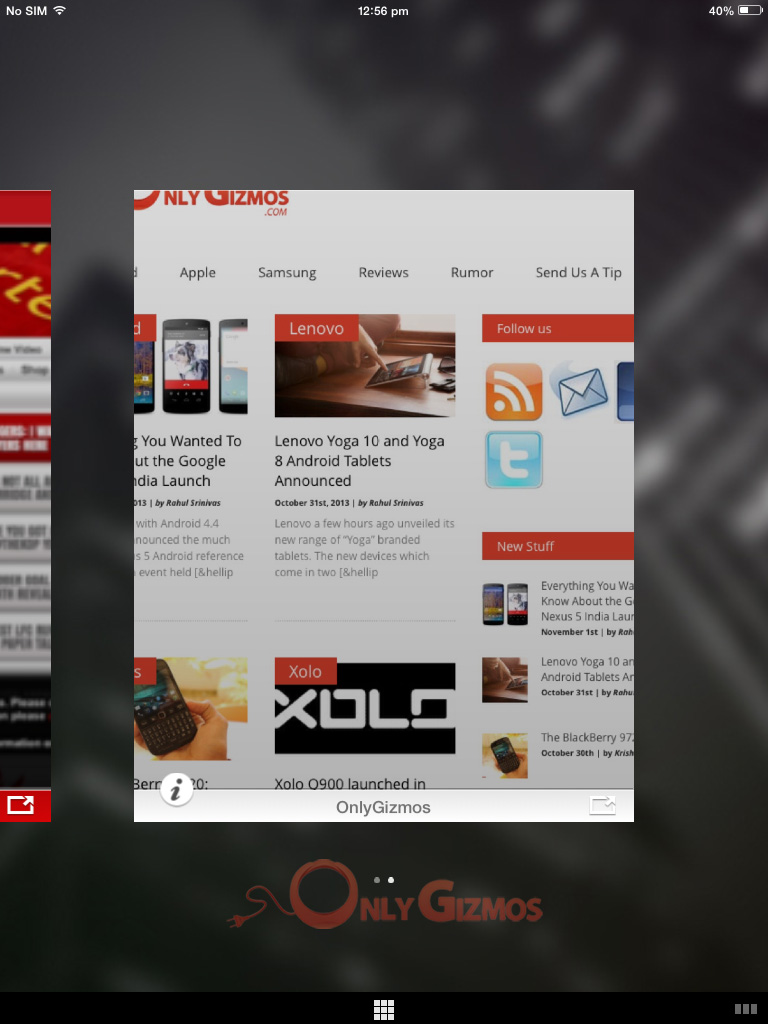
The pulled in page displays a tab below each opened page. It enables you share the particular website on by tapping on the right side of the tab. You can also scan and rank open pages for encryption, reputation, and trust levels by tapping the ‘i’ icon on the left of the tab.
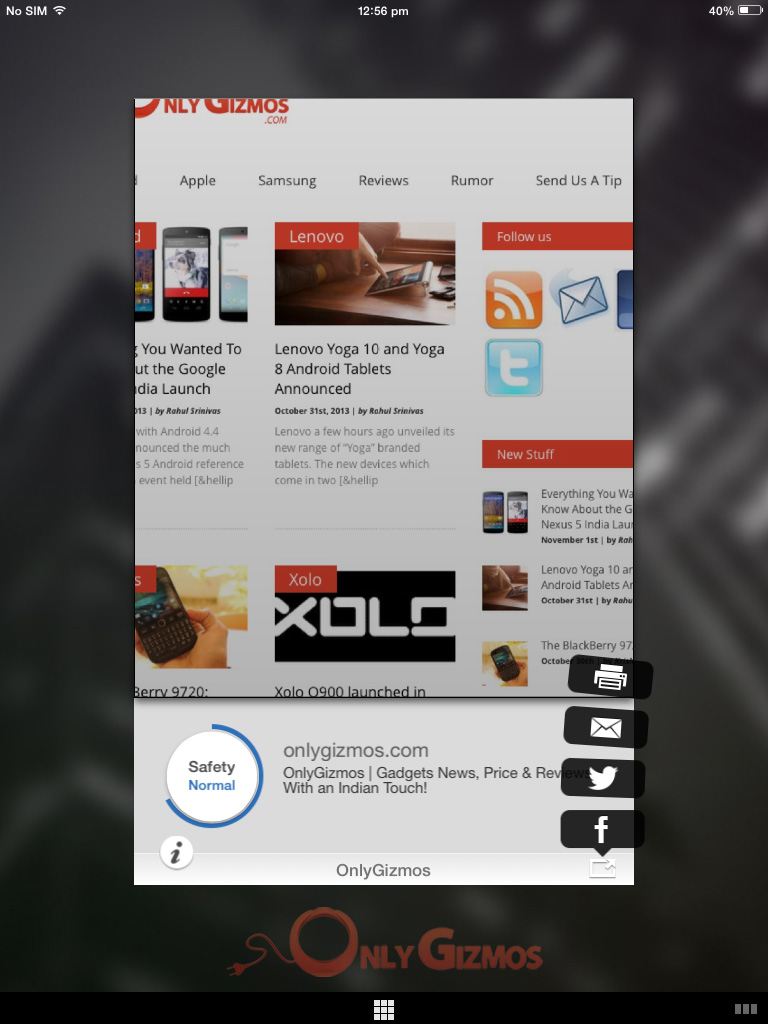
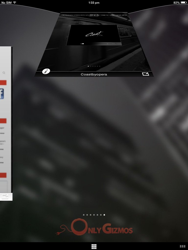
On the same screen, you can close a particular page by swiping it to the top. (Just like you close apps)
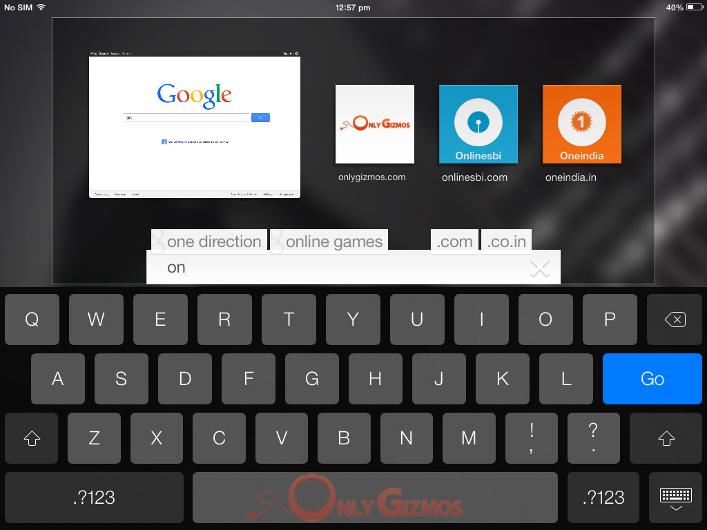
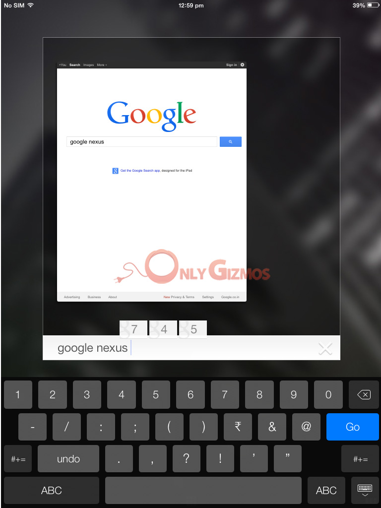
Searching on Google:
The browser is quite smart and when you type anything you’re looking for. It automatically suggests website names which you might likely want to open. On the far end of the text box, it smartly displays the web extensions like “.com” and “.co.in”
Browsing Experience:
At first, it may be slightly confusing to use. But if you are a regular iPad user then you might as well get a hang of it pretty quickly. You’ll feel that it is the best browser made for the iPad. The gesture oriented features and with a full screen webpage; Coast is indeed does a wonderful job of enhancing browsing experience on the iPad.
Coast by Opera is available for free on the App Store and can be downloaded from here: Coast

