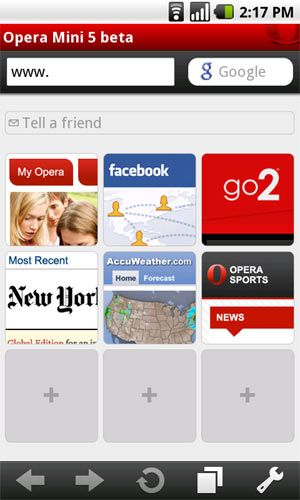
The first reaction that you get when you open the Opera Mini 5 Beta is that its slick and super smooth when it comes to the interface. Every menu action combined with web browsing is such a seamless experience that you never know the difference between browsing and selecting Opera menu’s (this of course was my experience on a WiFi and maybe the same on a 3G networks as well, I tested them using my Samsung i5700 with Android 1.5).
The first features that jumps out at you as soon as you open Opera Mini is the screen tab feature. People over at Opera did a really good job of porting features of its desktop browser to the mobile interface (or at least tried to). This is a new concept being added to most browsers and is also found in the Opera’s desktop counterpart (found on Google Chrome as well) to enable users to keep most frequently visited sites on their finger tips and add to their overall browsing experience.
Text size options of Large, Medium and Small are well selected and can really help with Android handsets with comparatively smaller screen sizes. This means that for all those deep-pocketed Android users, having the big screen real estate like the Droid/Milestone, will have a browsing experience just as good as that on a laptop or an MID. Nonetheless, browsing was a joy using the Opera Mini on my i5700 as well (still awaiting the official 2.1 update for India).
Basic set of features like the automatic selection of a web address (the part after the www.) on tapping the menu URL bar, built in .com button on the keyboard, dedicated Google search box, webpage tab button which enables you to traverse through or close individual pages are all features found in the making of a good mobile browser, and no doubt are present in Opera Mini.
Double tap zoom-in zoom-out works well, although I did experience a little glitch every now and then while zooming out, but not something that stands out. The purpoted 90% compression must work really well, cause I tried opening up the heaviest of non-mobile pages as I could and Opera panned them out like bacon and eggs. Performance on WiFi was as expected pretty snappy, much similar to how it would feel on a 3G connection, only if I could afford one. But still, browsing on my TATA DOCOMO Bangalore EDGE/GPRS I must say was preety decent.
The concept of selecting text on the webpage is something that most Andoid third party browsers or for that matter even Android’s native browser lacks. Add to that the fact that Opera built the nifty little context menu for searching the selected text in Google in a new tab or just simply copying it. This combined with the Opera’s trademark features of choice of webpage image quality, and the option to enable/disable rendering images while the webpage is being loaded make it a really customizable and nifty browser. The “Mobile View” option was really interesting, turning it on forces the opera engine to automatically render non-mobile pages in mobile format. I assume it does this by getting rid of all the table and row formatting of the page in which elements had been arranged and shown all items in a pre-zoomed in mode. Well at least this is how it seems to work regardless of my interpretation of its functionality.
Other features like physical keyboard shortcuts, for instance pressing * and 7 would take you to straight to Gmail, are like blessings for those obsessed with a physical keyboard on their devices (at least you can make good use of them now). There is a seperate tab for downloads which is a nice little addition to the entire package. Another great feature that Opera have come up with is that of shared bookmarks. Just by creating an account with Opera, you can have your entire list of bookmarks ported from your desktop to your mobile browser and vice versa. Saving a page takes a snap shot of the entire page and stores it locally on the mobile which can be retireved later and takes no rendering time. For those of us with rather large fingers, pressing the arrow keys enables the mouse mode and there you go, you have the good’ol trusted mouse to click on those nagging too-close-to-click links.
These are the features that make the new Opera Mini to be added to the “Must-have’s on Android” list, or for that matter on all mobile platform (assuming that the design specs have been kept consistent across all platforms).
The only deal breaker (for now) that I found was the fact that for some God forbidden reason, it cannot be made the default browser on Android (people who are able to do otherwise, please send me a PM, I’ll buy your Android phone). This after much research on the internet boiled down to the fact that it because its still in BETA (oh how we hate you) mode.
In conclusion, the Opera Mini 5 Beta for Android definitely makes it to my list of required tools on my Android device, given the fact that they are free. But for now, the users won’t be able to use the goodness of the browser from context clicks and hyper-links from other applications and only use it by launching it explicitly.
Image Credit (we are trying hard to get the screenshots working on Android, thanks)


Dinesh, switch to Android 🙂
The browser encounters some issues when submitting form data, like tweeting or writing a mail. You often have to try 2-3 times to complete process.
It might be an issue specific to my handset cause I didn’t try out browser on other mobiles. I faced the issue on Nokia 5230 and Airtel GPRS.