Microsoft’s Skydrive has been around since long and it seems they are now changing gears to compete in the buzzing league. On the mobile front my interaction with Skydrive was the most when it was integrated into Windows Phone 7 and became a competition to iCloud / Google+ auto uploads on Android. Skydrive is now taking a shot at Dropbox. A popular online file storage and sharing platform, Dropbox has been in the news for the right reasons for long.
![]()
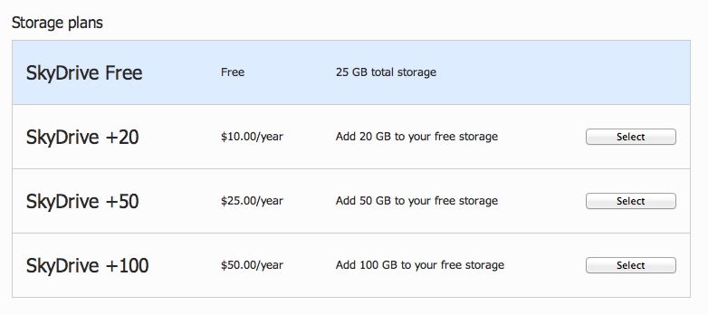
Dropbox has fast become my favorite app for sharing files and storing content on the cloud. With 2GB of free space and a referral program that can potentially take the free storage to 16GB, I am currently at 7.2GB of free storage. However Skydrive ups the game with 7GB of free storage for new signups and 25GB for all existing users of Live ID.
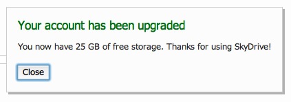
A quick login to Skydrive online, click of a claim button and I have my 25GB of space. There is an app for Mac available and I am started within minutes with all my Windows Phone 7 documents / photos downloaded on my Mac via Skydrive. My initial thought: it is 25GB of FREE storage, this is IT. But as I spend a few minutes with Skydrive, I realise that I am used to Dropbox and it would take time to shift to Skydrive if at all I want to shift.
In the last few months, I have seldom attached a file in an outgoing email, upload the file to the Dropbox public folder and share a link is the default choice. Dropbox installs on my system as a native folder and a quick icon on the menu-bar lets me access it with ease. Skydrive replicates this bit very well, a folder and an icon on the menu-bar.
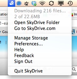
But it is the small things that break the deal. A quick click on the Skydrive icon gives me options that are good for a desktop application, not for a cloud app. A quick look at both the options will tell you the story, Skydrive lets me visit Skydrive folder or go to Skydrive.com amongst management options.
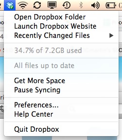
Whereas the Dropbox in addition to those gives me a quick snapshot of available space, allows me to pause syncing and even peek into recently changed files – thus living up to the collaboration theme it carries.
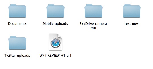
The quick glance options on the menu-bar may be considered trivial, but there are a few more things I instantly missed when I jumped into a Skydrive folder. There is no notification for or difference between files that are uploaded and the ones which are being uploaded to the server. Same for the files that are yet to be downloaded.

While Dropbox would show you a small icon next to the file, indicating that it is still transferring, files downloaded on Skydrive would simply show up when the download is complete.

At the same time there is no option to pass a public link to a file uploaded on Skydrive via the desktop folder as you have in Dropbox, even though the option is available for sharing files from the web interface.
I may be taking away some charm from Skydrive by excessive comparing it to Dropbox, after all Skydrive blesses old time users like myself with 25GB of free space. But this is perhaps the age when I prefer using an iOS over Android for its elegance (and apps), I choose Facebook over Orkut for its Web 2.0 nature & network effect and I use Gmail over Yahoo for its awesomeness on multiple levels. I would happily stick with my 7GB of Dropbox space, evangelize it till I reach 16GB of free storage and perhaps even after that and perhaps dump a whole lot of data on Skydrive that I rarely need to access.
On a positive note, Skydrive may well take off with Windows Phone 7, after all Dropbox has no mobile OS to ride on. No matter how awesome third party apps are, a OS level integration would help Skydrive succeed with Windows Phone, but it isn’t a service that will make Windows Phone succeed by its sheer presence. For the moment we wonder when would Larry Page click the red button and launch the long rumored Google Drive.


