The C7 has been seen by many as an attempt by Nokia to offer a watered down and more affordable version of the high-profile N8. Although Nokia officials had claimed that the N8 would be the only Symbian ^3 handset released in India, we had heard that dealers were clamouring for the Nokia C7 (which runs the same OS) as it was lower priced than the N8 and seemed better value for money (a smartphone with a 8.0-megapixel camera for around Rs 20,000) for consumers. We even spotted the C7 in the market weeks ago. However, it is only now that we have got our hands on the handset itself. Let’s take a quick look at the how the phone looks and its first impressions.
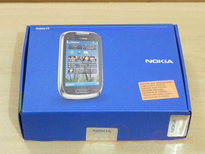
Nokia seriously needs to improve on packaging its products. We felt a bit deflated by the thin blue cardboard box, which shows a picture of the handset and highlights Nokia’s free lifetime push mail service. Neither makes the package look any better.
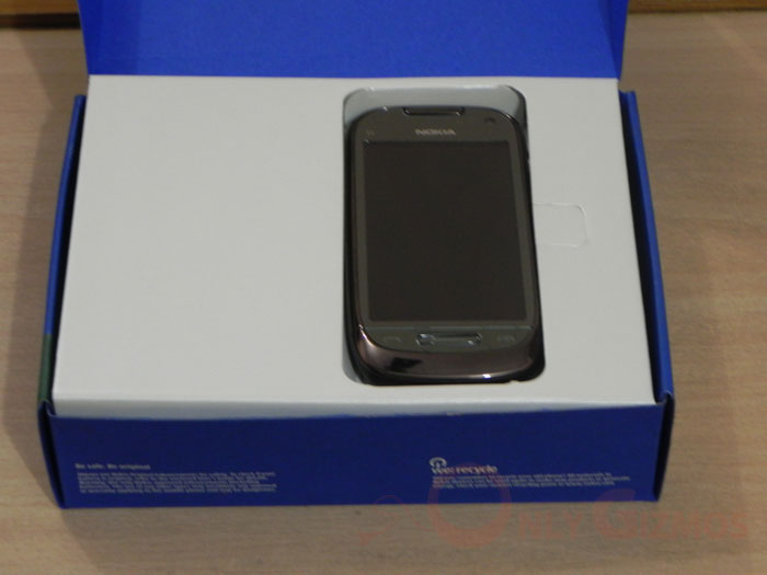
Lifting the blue(s), revealed the C7 handset, which is rather pleasant looking and slim. The shiny metallic brown colour of the phone makes it look quite gorgeous at first sight. Much better than the more industrial-looking and rather bulky N8.
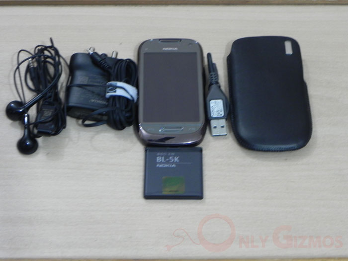
The Nokia C7 comes with a regular set of accessories that include a regular headset (a better headset could have beendesigned for this beauty), a three pin charger, a battery, USB cable and a cover.
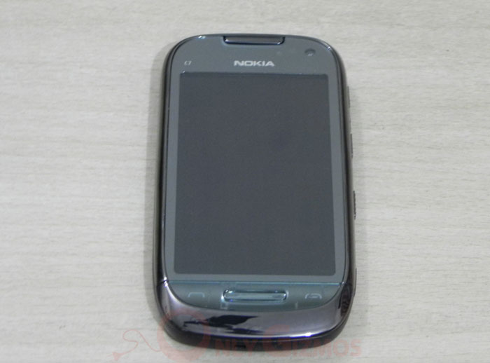
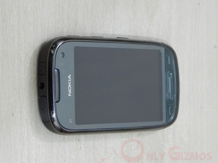
This thin and light phone with curved edges fits well in one hand. With a large 3.5 inch touchscreen, call end and receive buttons, and a home button, the front of the phone is relatively uncluttered. On the top is a front facing camera for video calls.
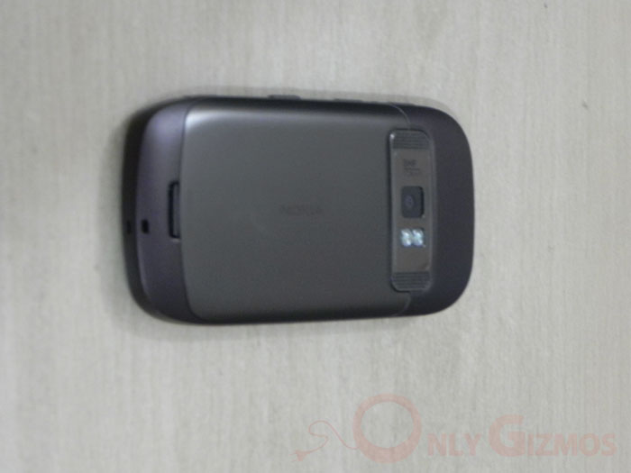
The back of the phone houses the phone’s 8 megapixel shooter capable of HD video, placed smoothly at the top of the phone with two small speakers alongside. The back cover in similar colour as the phone body is made of plastic, and fits very snugly unlike in some Nokia phones. Again, the entire effect is far sleeker than the N8.
A look at the top of the phone shows us the USB slot, a 3.5mm headphone jack and switch ON/OFF button. All three have been made big enough but still do not to spoil the look of the phone.
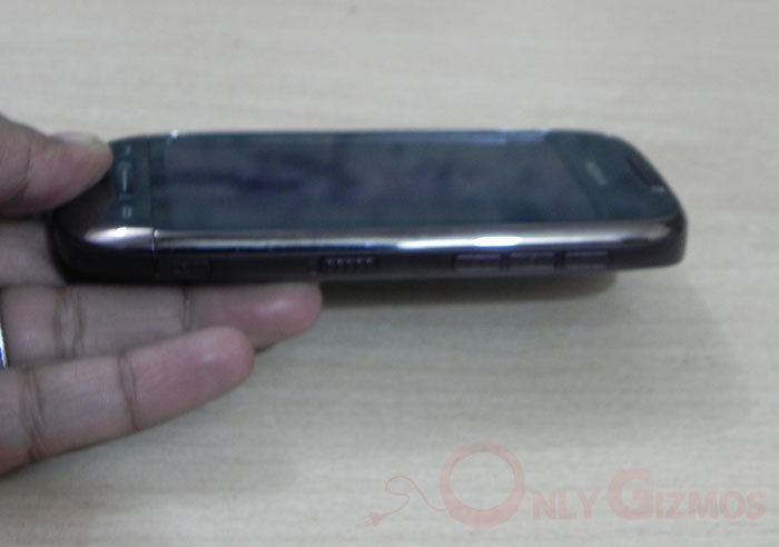
Turning to its right we have more buttons that blend well with the phone’s design (again, very unlike the crowded sides of the N8) – the multimedia volume and record keys that can also be used for zooming in or out while using the camera, a screen lock button and a dedicated camera button.
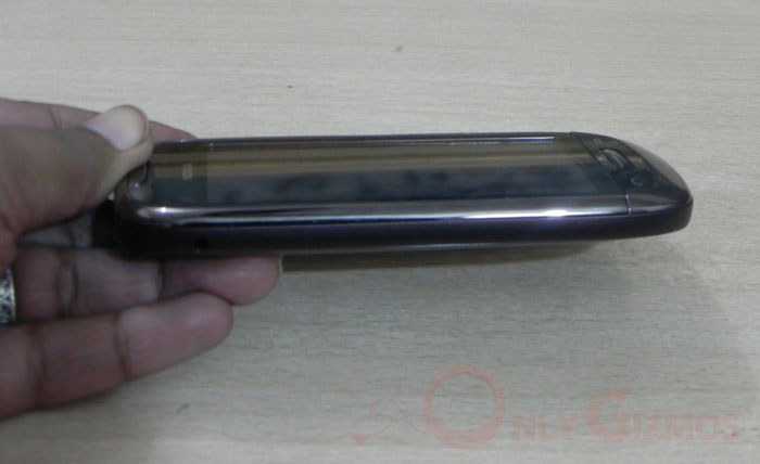
The left side of the phone has the traditional Nokia single pin charger slot, hidden away unobtrusively leaving most of the side blank. As you can see, the look is a lot more minimalistic here.
All in all, the C7 looks a lot better than the more muscular N8, according to us. Both handsets have some similar features – the 3.5 inch touchscreens, Symbian ^3, powerful cameras that do HD video – but when it comes to looks, are extremely dissimilar. Our dream phone of course would have had the N8’s specs, the C7’s looks and the C7’s price, but if it is sheer looks that matter, the C7 wipes the floor with the N8. And even in the specs department, it does pretty well for a phone that costs Rs 18,500.


