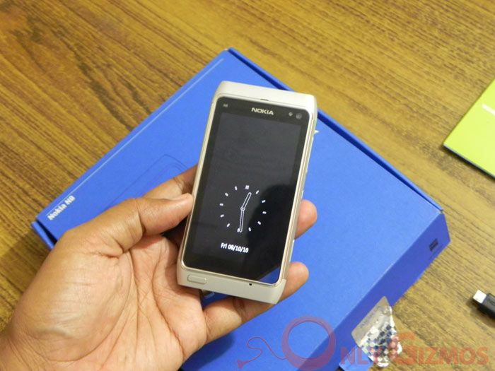
A few years ago, people would have laughed if you had said you were going to write about how a Nokia phone looked. After all, Nokia phones were supposed to be performers rather than lookers. Times, alas (we think) have changed, and with the N8, Nokia has certainly attempted to come to the cellphone beauty contest as well, sparring against the likes of Samsung, HTC, Motorola and Apple, the folks who brought snazziness back into handsets. Well, it has been a couple of days since we have had the Nokia N8, and while it is still too early to draw conclusions, we daresay we know enough to talk about its appearance and its design.
Let’s get one thing clear before we begin – we have been Nokia fans in the past. Simply because right until 2008, the company made phones that actually worked. They might not have been easy on the eye, they might have been clunky, but heck, when it came to performance, it was hard to beat a Nokia, be it multi-tasking, e-mail, multimedia or battery life. You used a Nokia and realised that beauty was only skin-deep when it came to cellphones – it was what inside that really counted.
And that seems to be the case with the N8 too. It has phenomenal innards, of which we will talk in the coming days. But unlike its predecessors, it is supposed to be good-looking too with an aluminum body, a rather amusing new shape, and a minimalistic front that has just one button – the menu key (shades of the iPhone?).
Truth be told, the N8 looks impressive as hell when you clap eyes on it from front – it has a lovely 3.5 inch AMOLED screen which is REALLY scratch resistant (we ran our nails across it, nothing happened!), a stylish looking metallic body and the shape is certaintly a move away from the regular rectangle-shaped N series devices from Nokia. The problems, however, start cropping up when you pick up the phone.
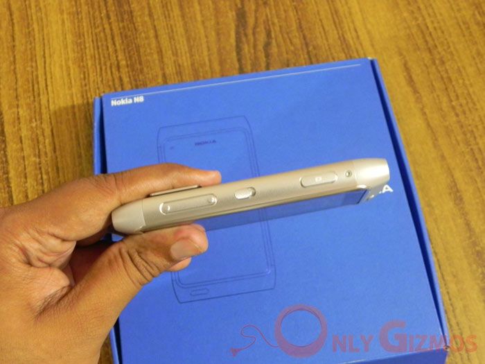
For one, slim it ain’t. At a time when devices are getting increasingly anorexic, the N8 clocks in at 12.8 mm – compare that with the 9.3 mm iPhone 4, the 9.9 mm Samsung Galaxy S, and the 10.9 mm Motorola XT720. There is no straightforward way of putting this – the N8 looks fat, and its rounded sides only increase the effect. No, it is not uncomfortable to slip into your pockets, but it does not look or feel sleek once it is in your hands and at around 137 grammes is not the lightest either
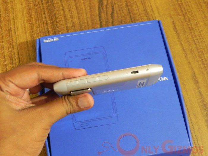
The sides are another pain to be honest. Thanks to the surfeit of connectivity options on the N8, there are ports and buttons galore on both sides of the device – the volume buttons, the micro SD card slot, the SIM card slot, the screen unlocker, the micro USB port and the dedicated camera button. And ouch, all are metallic. The result is that whenever you hold the phone, you never quite get a feeling of holding something smooth. Things actually get a bit unpleasant when you put your finger on the camera button – your thumb ends up resting over the open micro-USB port which has sharp edges. Not comfortable, really.
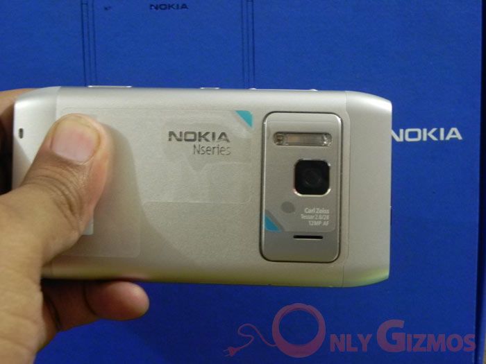
The back of the device is relatively painless with the camera and Xenon flash dominating. Alas, they both jut out, adding to the width of the device and not doing too much to its aesthetics.
The top of the phone is again a place for ports and slots – the power button, the HDMI slot and the 3.5mm headphone jack. And the bottom has a place for the old pin Nokia charger and has lots of model specs written out there – why there of all places we know not. The last thing you want on your handset’s body is text.
All of which might have been forgiven if the Nokia’s display had been attractive enough. Alas, it comes a very sorry cropper. It has neither the resolution nor the brightness or richness of colours displayed by the likes of the iPhone 4, the Samsung Galaxy S or even the relatively old Sony Xperia X10. The net result is that the phone is hardly at its best when its switched on, widgets and all notwithstanding.
So how does one rank the N8 in the look and feel department – we really tried to be positive about it, folks, but let’s face it, the brutal truth is that the phone looks great when lying on its back, but loses a lot of its charm when picked up. It is heavy, not very comfortable to hold and even when you do hold it, is unlikely to stop traffic, unlike the Galaxy S, the iPhone or even that glorious veteran, the Razr.
It may have the specs, but the N8 is not a winner in the looks department. And yes, we Tried to love it. Really



Damn, these reviews are really becoming confusing. I know it is personal preference but how the hell can a stack of websites say how comfortable the N8 feels in hand and then one like this mentions how uncomfortable it is. One says what a beauty the phone is and another calls it anything but. Yes, beauty is in the eye of the beholder but surely not to such extremes.
I wish people would also just get on with the stuff that really matters. We keep hearing about looks and fancy animations and graphics. I want to know what it is like to use as a phone etc.
If I wanted pretty I’d stare at my girlfriend! Not my phone…
Wow, you guys are clueless. Seriously and properly clueless.
I noe that this comment may not pass the moderators but for the little time it stays, trust me there is somethin wrong here.
Firstly take another look at those pics..see anythin strange???
well all of them have been resized and may be edited. This phone definately isnt this fat. And there is a feeble attempt in this review to make it look un-biased.
I dont noe if this website has a thing for nokia, or it is gettin somethin for this but all would agree that something’s fishy here.
Almost all websites say that its a sleek phone and even the weight is an asset. This guy compaires a piece of plastic and a smooth curve of anodised aluminum and uses words like Ouch for it . He says the usb button hurts his thumb while clicking pictures, has he ever seen iPhone 4. Next he is complaing about too many ports n slots, if there werent he would be complaining about that. Then about the text on body, i think the Nokia deservers the right to at least put there name behind their phone..n if u r talking about HDMI port, would you prefer a port with blank black cover or a port showing off its HDMI capabilites.
Then he talks about n8 having less pixels than iPhone, who needs more pixels than you can see, most people wont even be able to differentiate and about the vividness go to this site to see n8 display slaughter iPhone’s
> forum.dailymobile.se/index.php?topic=31360.0
If these guys really tried to love this phone then at least they should have named all its features.
Since im not a very good writer myself:
Go to the review given by gsmarena or NDTV gadgets, and learn how reviewes are written.
“Your website may have the specs, but the it is not a winner in the looks department. And yes, we TRIED to love it. Really.”
this reviewer is a real dumb n idiot. All the ports are common anywhere smartphone with so manh pictures. He tried to act very smart in writing this review.
My preordered N8 is rocking. I love holding it. It is power packed phone. Name a feature. It has that 🙂
nokia n8 really sucks when we take iphone 4 for comparison..!!ya its camera is good ,but when it comes to performance iphone wins…as i have operated the both in my own hands,i wud suggest all to go fo iphone 4….
I know the comparison but compair the price and N8 starts lookin gr8
Just another hate-nokia magazine… i understood as soon as i read “we was nokia fan in the past”.. common sentence every hate-nokia/apple fanboy magazine use when start speaking about Nokia.
I tried N8 for almost a week.. cellphone is impressive, construction is amazing (metal body is rally nice) and Symbian^3 is a great improvement… but come ok.. continue to talk about iphone4 that allow us to VIDEO CALL!!!! wow… in Italy we did this i think in 2002.. and yes.. with Nokia…
Aha let me clarify a few things as the editor of this blog:
1. We arent Anti Nokia or something.
2. The images have been resized in proportion by professionals and by NO MEANS IT is tampered to make the phone look fatter or something. Its 12.8 mm…
We shall continue our review and you may also hear our podcast previewing the N8 here: http://onlygizmos.com/discussing-the-nokia-n8-preview-gizmo-podcast-5/2010/10/
The review are even worse than Engadget/Gizmodo. Highly biased and undermining the N8. Even those tech site agreed that the N8 build is top notch except for the OS. Many unsatisfied with the so called outdated Symbian^3 but for you guys no, you go even as far as bashing the great build quality and design of the N8 hardware. Yes i call bashing because of the baseless criticism.
Well, it does seem to be rife with ports and yep, the open micro-USB juts into my thumb when I take a snap too – the snaps are awesome though. Width-wise, well, the stats do bear it out that it is significantly fatter than some of the competition. The display is relatively low-res – a bit of a surprise in this day and age. Opinions on appearance vary from person to person, so I am not going to get into that apart from saying that heck, I think the E71 and E72 handled metal better.
Never mind, this review will not be taken seriously, esp by a Nokia N8 user and who know how things are. Baseless criticism is what this article can be best described as.
I bought the 5800 Xpressmusic and have been forced to live with the ugly girlfriend that is Symbian for nearly two years. I have also held the N8 in my hand and had the displeasure of assessing its build quality. I am hardly a Nokia hater (or at least I was not until I used Symbian)…
As an industrial engineer I would say that this is another bomb from Nokia….Watch their market share shrink even further.
1. Clint: It’s really a matter of opinion. Looks are so subjective,
aren’t they. Yes, we would also rather stare at our better halves too
– well said, sir!
2. Mark: Every statement we have made has been backed up by experience
and rationale. You may not agree with it, but that is your right and
we respect it. If that is being clueless, we can live with it.
3. Tanishq: Thanks for the feedback. Nope, we have nothing against
Nokia. Really.
4. Mur: Thanks for the compliments. Wish we could accept them. We are
so glad you love your N8.
5. Hck: We agree.
6. Toco: An excellent point. Look out for the other parts of the review.
7. Luca: We are not a hate Nokia website, but that does not mean that
we will blindly praise everything they do. If they slip up, we reserve
our right to say so. And we never said “we was nokia fan in the past”.
8. Symbian: We respect your opinion and your right to express it. As
for Gizmodo and Engadget, we are flattered to be mentioned in the same
breath.
Is it only the Indians that like Symbian? Must be a cultural divide? You gotta hand it to Nokia they targeted a large base!
The nokia fone u seem to love b4 was 3310 where this good features and bey0nd ur capabilities and mind nseries abilities were not yet discoverd,
Its quite good brainwashing it works for people like u who just didnt kn0w symbian3/nokia that far.
Does the other have 3g videocall?
Or a milkyway with xenon flash?
good review. I like my n8. it’s a little heavy and slower than my old phone. it had a really fast processor. but this is practical for my business, great unlocked cell phone. it’s easy to use, and manuever. wifi and email are practical and great for helping me keep in touch with my clients. much better than my friends unlocked htc phones. the games are fun and keep my wife and daughter busy on the long trips. facebook and games are really fun and simple enough for my younger son. speaker phone is great and the gps helps me because I refuse to stop for directions!! also got our samsung unlock codes and imei unlocking for free! got our last couple n8’s at .com 2 thumbs way up