Authors Note:
It’s been long since I have handled a new Nokia device and yet as I hold the touch and type E6-00 in my hand, it feels very familiar to begin with. Until last year, the Nokia E63 was my primary phone, and I have used the E61i, E62 and the E61 extensively before that. All of these were sturdy business phones with a full QWERTY keyboard. With the E6 Nokia throws a touch screen to the mix. As I start to use the E6, my first thought revolves around the perspective with which this review should go live.
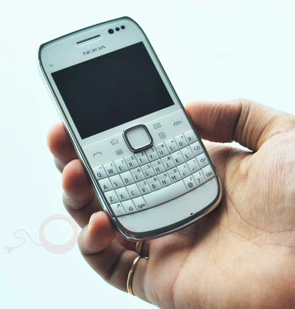
Having been a user who loved the sturdy design, fast QWERTY and the fast navigation on previous E series devices, I realize that there are plenty of E71, 72 and other E series users contemplating a switch to the E6. The review of the E6 can’t be a comparison with an Android or an iPhone; perhaps to an extent with the Blackberry range given the form factor, with this in mind, I begin.
So is the E6 our recommendation for your next E series purchase? Let’s find out.
Meet the Nokia E6-00
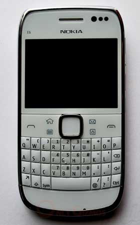
E6-00 brings Nokia’s touch and type approach to the E series. Nokia had seen a lot of traction with its E series phones that pack in a physical QWERTY and the form factor has come a long way from a time when it had neither camera nor WiFi (i.e. Nokia E62). Over the past few years Nokia has delivered several hits like the E61i, E63, E71 and the E72 in this series. While the Nokia E5 can be considered a successor to the affordable E63, the E6 comes as the big brother that packs in a better display, camera and runs the Symbian Anna.
At a suggested price of Rs. 16,999, the E6 has competition from several full touch screens and a few Blackberries (Curve 8250, Curve 3G 9300 & others). However at the same time, there is a huge base of E series users who are looking to upgrade from an E71 / E72. The E6 serves as an alternative to these Androids / Blackberries and at the same time gives an upgrade option to existing Nokia users. With a touchscreen and the same Symbian version that powers latest full touch-screen offerings from Nokia, the expectations from E6 are high.
Nokia E6 Specifications:
- 2.46-inch TFT LCD, Capacitive touch screen
- 640×480 resolution (326 ppi)
- A-GPS / Bluetooth 3.0 / WiFi
- 8MP Camera with Flash + VGA front camera
- 720p Video recording
- 8GB Internal Storage + MicroSD slot
- Micro USB Connectivity
- 3.5mm AV connector
- Battery 1500 mAh
- Weight 133g
Hardware / Design
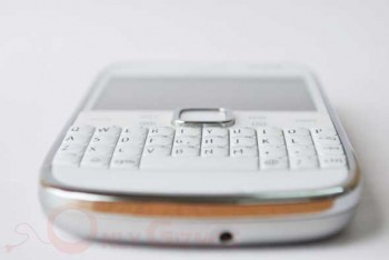
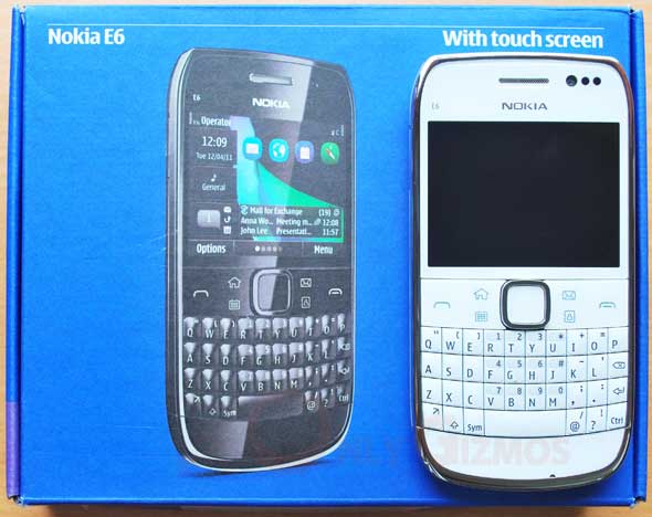
The Nokia E6 is a beautifully designed phone. Nokia has its lessons from the previous E series models and delivered a good blend of physical QWERTY with plastic and metal finishing. The sides have a chrome finish and the screen area is complete with gorilla glass. The area around the D-pad also has a glass finish with six buttons on the same panel, two large buttons for call (Yes) and disconnect (No) and four shortcuts (Home, Calendar, Email and Contacts).
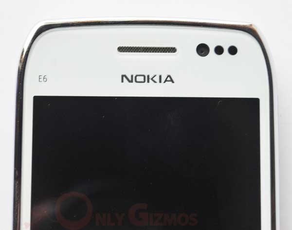
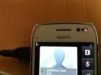
Next to the earpiece you would notice three round spots, one of them is the camera while the other two are light and proximity sensor. These are pretty visible spots and all the more so on the white color handset that we handled, a couple of them more and this would have become a solar system designer handset. While looks are subjective, we found the visible red light coming from the proximity sensor during an active call to be a little distracting at times (see image). While this isn’t a major issue, Nokia’s choice of navigation options on the E6 marks a significant change from what we have seen before.
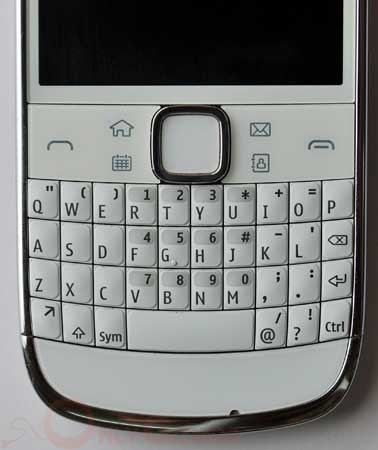
The options and exit keys that you would find on almost all applications right from messaging to photos aren’t physical keys but onscreen. While the oldies like Treo 650 (for the ones who don’t recall, Palm’s Treo 650 is one of the most memorable handheld that ruled the smartphone world half a decade ago, it packed in a touch-screen and QWERTY) allowed you to operate the device completely using the physical keys, Nokia’s approach requires you to use both, the touchscreen and the physical keys (more on this in the software section). Speaking of the backlit QWERTY keyboard, it is pretty crisp and typing on it is as smooth as the E63.
However if you are picking the white color handset, do note that the visibility of the white keyboard is affected with the backlit being of the same color, we believe the black version would serve better here (Update: we have been hearing the same complaint about the white colored E5, clearly Nokia has some work to do here).
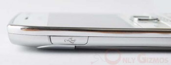
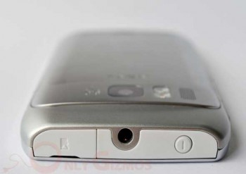
Nokia has brought in a dedicated slider to lock the screen and also pushed a dedicated voice controls button between the volume keys, all of these on the right side with only the MicroUSB connector on the left. The E6 lacks a dedicated camera button nor can you reassign the voice control button for anything else. The 3.5mm AV connector is on the top along with the power button and MicroSD slot.
The MicroSD and MicroUSB slots have a rubber cover protecting it and the build quality of the same is as always, very impressive! It may be a little hard to open the MicroSD cover if you aren’t growing a long nail, but it isn’t a trouble unless you keep hot-swapping the memory card every few hours.
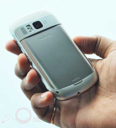
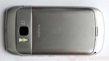
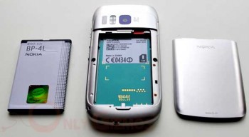
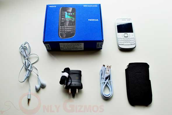
On the back you have a metal battery cover and a plastic housing that gives a metallic feel. The little bulge on the top houses the 8 megapixel lens, dual LED flash and a tiny grill for the loudspeaker. Nokia’s standard 2mm charging port is at the bottom, but if you are in a part of the world where finding a Nokia charger is difficult (and that’s certainly not India), you may use the MicroUSB port to charge your E6.
The light sensor on the E6 does a good job of increasing the brightness when there is a glare / sun and reducing it when in shade. Thus giving you a clear view of the screen at all times. However the sensitivity of the sensor can get annoying as even slight fluctuation of lightening indoors triggers that switch in brightness. For instance when in a coffee shop with an over head light the display kept switching brightness high and low with even a slight change in angle due to typing a message, it gets further annoying as the backlight on the keyboard also toggles in between typing a message.
Software: Symbian Anna
With the capacitive touch screen, Nokia also brings the latest version of Symbian to the E6. Symbian ‘Anna’ is the same OS that run the latest touch-screens like the X7 and an Anna upgrade to the E7, N8 etc is in works. For a E6 this means a much more capable operating system with touch controls. Anna initially appeared as a version for full touch screens and not something like WebOS which was rolled-out right from the beginning as an OS that supports a full QWERTY beneath the screen. So does the Symbian Anna deliver?
Homescreens + Widgets
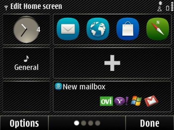
The homescreen treatment looks pretty much the same from the time we saw the N97, widgets with rectangular blocks that can be customized. Symbian touch-screens allows you to place widgets / icons on the homescreen with predefined rectangular boxes. These rectangular boxes can either house a complete widget like for mail and music or incorporate any four shortcuts (say camera, notes, maps and Ovi). The E6 has 4 home screens with 3 boxes each, so that’s a total of 12 customizable boxes.
Widgets like mail let you see the last 2 emails without entering the inbox and that’s a handy feature to see incoming emails at a glance. The clock and profiles boxes that you see on the left sidebar of the homescreen remain constant. You can press and hold your finger anywhere on the screen to enter the edit mode and then go on to add/remove shortcuts or widgets. Here you can see a quick video demo of the Nokia E6 home screen.
Navigation
We mentioned the navigation bit when discussing the design, and as you would notice in the image above, the option / exit buttons are operated by touch only. Thus, making you use the touchscreen controls often. For someone who has been used to a complete key control in the previous E series models, this breaks the flow and more importantly slows down the navigation. The basic issue here is the difference in feel when moving from physical button to a touchscreen and in a split second return to the physical keyboard again.
QWERTY users are known to be FAST and thus the frequent use of touchscreen to exit or get into options doesn’t deliver the same efficiency that one is used to. To an extent this affect is negated by the center key in the 5 way D pad. It wouldn’t have been very difficult to accommodate a couple of navigation buttons, but that isn’t the approach Nokia has taken. Nokia wants you to use both touch and physical buttons here, a point we debate. The approach that made the Treo 650 so handy was the fully functional physical navigation along with a touchscreen, and yet the touchscreen had its own utility.
Given that we are discussing this topic, we would have also loved to see a lot better utility from the touchscreen, something as simple as dialing a call by pressing large numbers on the screen instead of using the tiny number-pad accommodated in the QWERTY or an additional ‘Call’ icon when reading an SMS conversation.
The basic premise of our request is to have a touchscreen in place to increase efficiency and not slow down the user, eliminate menus and bring smart navigation. The E6 carries primarily the same menu system when compared to the E63. Why does one need to have over 40 icons even before installing a single app on a smartphone? That too in folders going 3 levels deep!
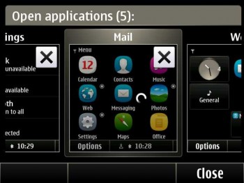
The E6 has a good multitasking interface that lets you skim through open windows (apps) and close whichever you don’t need by just hitting a cross (X) on the top. This works well, you can enter the multitasking mode and view all open applications by just holding down the home button for a couple of seconds. However, one of the many UI inconsistencies on the E6 is seen on this screen. The cross (X) button isn’t really on the top end of the window. So if you just hit the top right of the window to close it, you would actually end up launching that application. To close an application you need to precisely hit the X button, which isn’t on the corner of the window but somewhere near the top right. This adds up to a long list of UI inconsistencies on the E6.
Internet
The E6 packs in an HTML browser. We tested the default browser and Opera Mini on the same. The very first thing we notice about the E6 browsing experience is the readability of fonts is poor given the pixel density. The browser could have been optimized to allow much better reading experience, but that isn’t the case. Opera Mini helps the reading experience and also allows much easy switching of tabs. Despite the improvements to the default browser, the need for Opera Mini for a usable experience remains.

E6 Browser

Opera Mini On E6
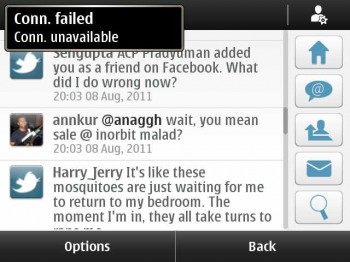
The WiFi connectivity on the E6 isn’t as strong. It struggles for range at corners where a mid-range Android or even a Bada OS handset does well. Add to that there is an annoying notifications popup on the top. While it’s good to have a pop up that seamlessly gives notifications, this one shows up a little too often for the same purpose “Conn. Failed / Unavailable”. You would see in this video when we were less than a meter away from the WiFi router, the error shows up more than 60 times in a minute.
Apart from the connectivity annoyance, there are two things that are flawed with this notification system. Firstly, it hovers over your content, the notification box is no small window and the 2.46″ screen doesn’t help either. You would find it showing up when you are reading something or need to press a button that is hidden under it, frustrating to say the least.
The second issue is a lot more serious, If you are in Ovi Social and browsing through tweets, you would notice that your scrolling is affected by the notification, it interferes with your work flow. While the notification system via a small popup (just like growl on Mac) is a good addition, it is supposed to be unobtrusive and allow you to work without any sluggishness.
Mail + Messaging
E6 allows you to setup various email ids without much configuration hassle. Gmail, Yahoo etc are the default options and you can easily go about configuring them. If you want to sync contacts (Google Sync in our case) you have an option to configure one Exchange account.
If you have multiple mail accounts configured on the E6, you may note that there is no unified inbox to browse them all together. We had reliability issues with the email app. The exchange account that we setup disappeared, leaving us no options but to configure the same again. On another occasion the gmail account we had setup started throwing a system error and required us to reconfigure. We would believe that the issues would be ironed out with firmware fixes, but the unreliability troubles us.
With the E6, Nokia brings in conversation view to your SMS, you can chose to see the inbox for individual messages or go to the conversation folder to see all chats. The conversation view packs in a sidebar with quick icons and you can even press a single message from the thread to open that specific message for forwarding or deletion.
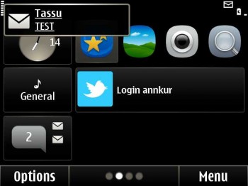
So the user has plenty of options, for the savvy ones conversation view whereas the classic inbox view for others. The E6 also throws a useful pop-up notification for incoming messages, you can just click that notification to open the message.
The UI inconsistencies of the E6 show up in the messaging app as well. Compose an email reply and press the ‘call’ button – the E6 would take that as a send command for that email. Similarly compose a reply to a SMS from Inbox and press call – the E6 would send the message, just like it did in an E63 or other E series models. However when you compose a reply in conversation view and press ‘call’, the E6 would dial a call to that contact and not send that message.
Media
The E6 sports an 8 megapixel EDoF / Full Focus camera. The lack of auto-focus we thought would be a let-down, but much to our surprise it performs pretty well. Even close-ups appear good. The dual LED flash does well for medium distances and the video output at 720p is satisfactory. You have an inbuilt image editor that lets you do cropping, resizing and a ton of other edits. Resizing comes to rescue when trying to share 8MP photos on the web.
One glitch in the gallery is the slow indexing. After we clicked an image from the E6 camera, it didn’t show up immediately in the gallery and thus sharing an image on twitter / FB instantly after clicking is affected. The image shows up after some time when the OS refreshes the gallery index.
On the back of the device, you have a loud speaker located right next to the camera. The music output from the loudspeaker isn’t very loud, but acceptable for a business phone. When it comes to the earphones bundled with the E6 the Nokia has packed in good quality. It is comparable to earphones bundled by any smartphone maker these days. Although the lack of audio control options on the earphones is missing, again not a concern for a business phone.
720p Video Sample Shot from the E6
Here, is a video sample shot from the Nokia E6. The output looks good, though a little dull in colors. Picks up audio pretty well.
Sample Images from E6 Camera
Here are some sample images shot at 8MP from the E6 camera.
Verdict
The E6 is a story of hits and misses. Nokia has got a good design, an otherwise hit combination of touch screen and QWERTY, despite lacking autofocus an 8MP shooter that performs well and an E series legacy behind it. But as noble as the concept of a touch screen and QWERTY combo is, Nokia fails to deliver a seamless experience with the E6. A Blackberry user may not have that powerful camera or a sharp touchscreen to flaunt, but the core use of the handset as a communication device is at its best with a BB. An Android user might not have such hardware + that killer QWERTY below a touch screen, but the UI that they have is still easy and far from convoluted as in the E6.
Despite all the love for E series and the quality hardware, it is hard to recommend the E6. If you are upgrading from an E63 or a E71, you might well consider picking up an E5 instead of an E6 (and still save a decent sum).
Note: The device in question seems to be referred as both Nokia E6 and Nokia E6-00 at different places on the web. The box we received says E6 on the front and E6-00 on the IMEI label.
Photos by Bharat Chhatre / With Inputs from Tassavur Shaikh

