Right from the desktop OS: Windows 7 last year to this years grand re-entry into the smartphone game with Windows Phone 7. Its been a busy launch season for Microsoft! Windows Mobile (as it was known earlier) was one of the first smartphone OSes to exist , and we just can’t forget the old XDA which used to be a full touchscreen more than half decade ago. Windows Mobile was way ahead of its time and we had all sorts of form factors coming out – Large full touch-screens, mini touchscreens, slide down keyboards and even regular smartphones with no touch. The rush that we see today for updating Android’s, certainly reminds of the old Windows Mobile days when ROM’s were hacked, updated, and devices bricked in the process.
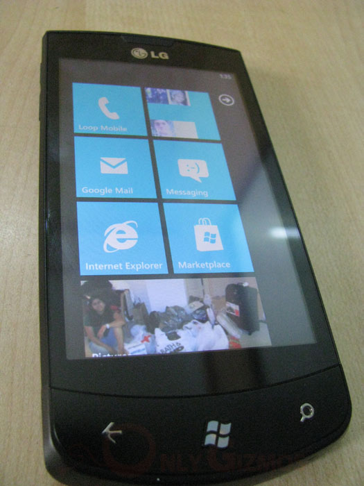
Microsoft certainly isn’t a new player in the game. They have seen it for a longer period than Google or Apple in this market, with their learning’s and a long 3.5 year wait after the Apple iPhone first made its appearance, we have Microsoft’s real reply. Windows Phone 7 is a completely different concept and takes an unexpected approach. Did we expect from Microsoft to have such stringent standards to make a Windows Phone 7? Fixed hardware specs detailed upto the number of buttons the device can have? Yes each Windows Phone 7 device needs to have the 3 standard buttons (back, windows, search) along with the camera and volume keys. As we hear, no more, no less allowed here.
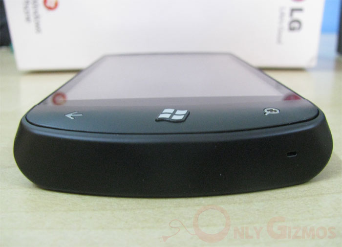
The interface is common with some innovation done by phone manufacturers on the apps side, but as it seems the amount of control Microsoft has here, we would see firmware updates for all WP7 handsets pushed out from Redmond and not the handset manufacturers! That should fix the fragmentation issue and the ROMs fight that we have seen for WM earlier, and many are currently battling the same for Android. While time would tell how the control strategy works out and evolves with time, we tested out one of the first Windows Phone 7 out in the market – the LG Optimus 7 (E900).
UI / Flow
If there is anything out there which gives you true sense of flipping through pages of a book, its Windows Phone 7. You can just jump in and out of apps and use the back button to go back to previous pages (apps, menus) you visited. The center key takes you to the home screen with the large icons or tiles as you may call them. The OS allows you to either pin contacts, apps, files or anything you like on the homepage as a tile or just go and browse in the menu that throws up everything in a large list (contacts like). But there isn’t any universal search or folders to make your life easy.
If not pined on the homepage, finding any app can be a task (scrolling through the menu page). The large icons / tiles do take a lot of space, and it is felt when the People app (contacts) shows the recent contacts, which displays hardly 4 contacts in one screen. Some optimization required here?
The notifications bar at the top displaying the icons for network coverage, wifi, battery etc is hidden by default. It shows up by either taping or sliding your finger on the top of the screen (though network bars show up automatically when phone app is used). Its somewhat unusual to have the network bars and battery hidden but we for some reason never miss them (a week into using the OS). This hidden gesture allows full screen length for the tiles on homescreen or menu to scroll, little significance for productivity but its more of a design choice as it seems.
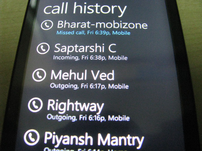
There are other things that we love, like the clear written text ‘Outgoing’ ‘Incoming’ and ‘Missed call (with a highlight)’ in the call log. Its hard to explain how irritating it is to decipher icons for these tasks every-time I change a phone (and that happens often). But then there are some other small frustrations like the center key (WP7 key) not helping in unlocking the device / waking from sleep.
Subjective! But we like it
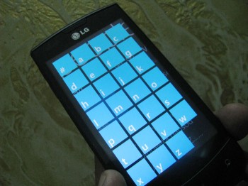
Windows Phone 7 brings in efficient pinch to zoom and one instant turn off from any OS in the post-iPhone era is fixed in Windows Phone 7 (cheers). Browsing through pictures in the phone or just zooming / panning, its super smooth. But come to the onscreen keyboard and we aren’t so impressed. Its good, better than quite a few out there, however not enough to please an iPhone addict. The WP7 onscreen qwerty is comparable to its Android counterpart, but they keys aren’t as spacious as the iPhone and if you notice, even Google realized it and the new Android qwerty in Gingerbread is much more like the iPhone (iOS) counterpart.

There is a long list of things in Windows Phone 7 that we want to be fixed. Right from the brightness control (no slider, only low, medium, high) to a easy ‘x’ to delete text from a text box (either while searching on Bing or contacts app). The back buttons can be confusing at times. Be careful in hitting that center key, a single press on the back key will take anyone to the last app you were at, in our case it was the mail app which would well have exposed Mr Spock to the world 😛 . On a serious note the lack of multitasking is compensated with the back gestures, but it takes time to get used to and we are interested in seeing what Microsoft pulls out of its hat in the upcoming update to WP7.
Internet & Connectivity
Windows Phone 7 is a cloud inspired or cloud based OS and an active 3G connection would be the only thing that does justice to it. Microsoft has certainly made good of its Facebook investment with deep FB integration into the OS (though you still need to download the FB app to add a little more meaning). We were able to sync with our Google account and get started withing minutes.
Microsoft has its own version of Internet Explorer on Windows Phone 7. And it works pretty well. While the rendering isn’t as accurate as mobile safari (on iOS), we were surprised to see IE mobile beat the iPhone 4’s Mobile Safari in our test (Video Below). Though 3rd party browser like Opera Mini does give the iPhone an edge, we would have to wait and see if Microsoft opens its gate for 3rd part browsers.
The OS does a total Apple and doesn’t allow you to access the internal storage in ‘USB mass storage’ mode. On the desktop the OS connects to the Zune software and for Macs there is a special Mac Connector that allows iTunes sync to begin with.
The email app, official twitter/facebook all have the trademark WP7 UI and we love the fact that 3rd party app makers are keeping up with the design structure of the OS. However the Facebook app or the Twitter for some reason doesn’t appear to be as snappy as we have seen on the iOS. No search option in Facebook either, perhaps we should wait for the Windows Phone versions of to app to mature to the levels of the iPhone app.
The default email app on WP7 looks good with the same swipe large icons / text and page flicking UI. The options include all, unread, flagged and urgent. The app also pics up all folders (in our case all Gmail labels) and allows you to sync individual folders on the phone. You can press and hold over an email to get a drop down with options like move, delete, flag or use the checkbox to do mass selection before an action. We quite like the manner in which the app retains a simple clean look.
WP7 supports multiple exchange accounts to be setup together (and isn’t that expected from Microsoft 🙂 ).
Marketplace
The WP7 Marketplace is growing and we spotted a fair bit of fart apps in there, yes the crappy ones for which the iPhone is severely criticized. However we also have the killer games NFS, Assassin’s Creed HD and a few more are the ones we tested (luckily they all had a trial period which we love).
We would admit that we haven’t spent enough time playing around with the Marketplace as we would have liked before a detailed review, but all we can say is that its promising to see the momentum here. The LG handset we tested had its own Panaroma Shot app and other manufactures are getting their own apps out aswell. Encouraging sign and healthy competition as it seems (without degrading the performance). The Xbox Live connection looks cool, though we are yet to test it (as it is supposed to work, pause a game on your WP7 and continue from where you left on your Xbox console.)
What we expect from the OS in the coming days?
Some very basic and crucial updates like Copy / Paste, Multitasking, Top Apps. A healthy update to the desktop sync software would also help put Windows Phone 7 from my ‘secondary device’ to the list of ‘can have as primary phone’. The game has began for Microsoft, the software updates are more crucial than the hardware in todays era (or if we say, they already have some top line hardware, software is the challenge). And one reason we remain optimistic about Windows Phone 7 is the fact that it is a smartphone platform and yet as simple as a feature phone. No reason why masses wouldn’t love it.
We initially compiled a long list of things that Microsoft needs to add here, but isn’t that quite obvious? What might make the difference is the manner in which Microsoft implements a lot of things. And we hope its better than the alphabet sorting that they have in their address book (People as it is called.)
Should I buy a Windows Phone 7?
Yes we spent a bomb ourselves getting a Optimus 7 from UK to India just for reviewing, but do we recommend you to go and get a Windows Phone 7? Well, as of today no! Some basic things like allowing 2 mobile nos for a single contact or checking from which number a particular contact has smsed us (incase you have multiple number against their name) is not possible on the WP7. Given that we are in 2010 and hitting 2011, there are some serious blocks missing in Windows Phone 7. The UI and feel is good, but the platform needs to mature before we can recommend it. For now, it is in our list of things to watchout for in 2011!
Any questions about Windows Phone Seven? Do throw them at us in comments below!



enterprise solutions within WP7 is the key. The share point access, word, power point, excel support within the phone will keep businesses interested. Also, the development is as easy as it can get (specially compared to iOS).
This is excellent.. smart phone operating systems need determined competition and I see that determination in Black-berry and Microsoft.
Thanks Saurabh
Yes, I am a consumer sided person hence might have ignored that. Quite liked the early impressions of MS Office there, would use it for a bit and add that along with share point to the review.
Ps: I am coming to US in Jan, are you around west coat?
Cheers
Annkur, in the onscreen qwerty keyboard comparison pic, the width of the three pics is not the same. The pic for the iPhone is the widest, followed by the Android, and the Windows Phone 7 pic is the narrowest. This is grossly unfair – no wonder the Windows Phone 7 will seem the cramped one while iPhone will seem spaced out. At least have the pics at the same width if you want your readers to do a visual comparison.
Thanks Peter, That wasn’t intentional. There isn’t a a screenshot app for Windows Phone 7 yet, so that was clicked by a camera (changing the width also changed the height hence the issue above).
The difference that I wanted to highlight was the spacing between keys. And that truly hit my accuracy and speed on WP7. I did notice that screenshot mess before posting, but the opinion came first, screenshots later.
I shall try and replace it with better screenshots soon.
Thanks for pointing again.
Hey Annkur,
Appreciate the honest review. I actually work as an AT&T salesperson and have been trying to pick up one of the windows phones because I really don’t have the knowledge that I need out on the sales floor. I have multiple co-workers with the phone, and they all seem to love in; in fact, 2 people actually sold their iphone 4’s that they had purchased to use the new Win7 phones. When I asked them why, they really just “wanted something new”. Apple keeps coming out with “ground breaking” new phones, but they’re essentially the same thing only slightly better. Everything looks the same, only it’s a bit faster with a couple of features. Personally I’d be happy with apple or windows in the situation, but I’m pretty surprised how well the Windows device is doing right after launch. Call quality and coverage seems to be pretty great, whereas the iphone still has issues with the terrible antenna (BLAME AT&T OH MY GOD!).
Anyways, appreciate the info and thanks for the review~