Nokia has long lost the lead when it comes to sales revenue to Samsung towards the end of last year, though they have managed to hold on to the largest manufacturer tag by the skin of their teeth.
And we already know how dismally they are faring when it comes to sales of smartphones in the developed markets like US or UK.
They all of a sudden decided to go with Microsoft’s Windows Phone 7 and have since then forged an exclusive partnership with them. And with that we knew that, in the platform confusion Symbain and Meego were the ones going to be compromised.
Nokia made a feeble blink and you miss it attempt with Meego based smartphone N9 announcing at the same time that they would be abandoning the same for reasons only known to them (read Stephen Elop) as the handsets, and the Meego OS was received warmly in the market by the tech experts and users alike.
And thus the Nokia Lumia 800 was born as the first device out of the Nokia-Microsoft partnership stable. It goes without saying that a lot rests on the performance of the Lumia 800 for Nokia and given the way they have been promoting the device all over the world, you sure know that a lot of Nokia’s fortune is riding on the device.
The success of the device is also important for Microsoft, who has finally found a solid and reliable partner for their Windows Phone 7 OS, for which they have been struggling to build an ecosystem. A committed partner in the form of Nokia gives WP7 some traction and helps attract a lot of developers to the platform. It is an opportunity to cover some of the vastly lost ground to Apple’s iOS and Google’s Android.
The device has received mixed reviews in the media and the tech industry and is still trying to find its feet in the market. The OnlyGizmos team also had mixed feelings about the device when we had our first impressions with the device.
So without much further ado lets go ahead straight to the Nokia Lumia 800 and see if it can really stand the test and more importantly the expectations of Nokia and Microsoft themselves.
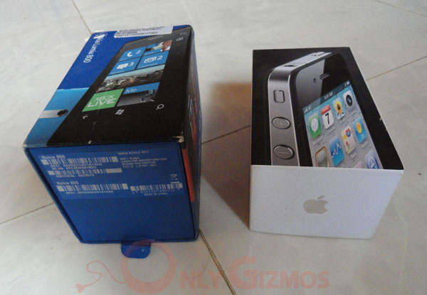
Before we go ahead and reveal the contents in the box I must tell you that box and packaging distinctly reminds me of the iPhone packaging.
Here, are a few sample images for you to see for yourself.
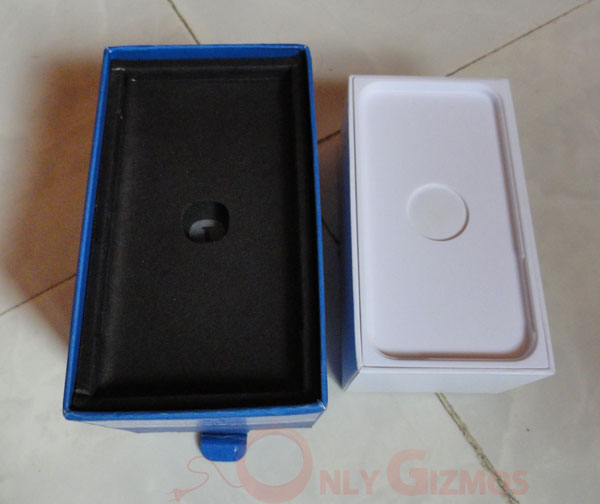
In the Box
- Lumia 800 handset
- Earphones
- USB charger
- Silicon Cover
- Manuals
Specifications
- 3.7” ClearBlack AMOLED Capacitive TouchScreen
- 480×800 pixels resolution
- 16GB Internal Memory
- 512MB RAM
- 8MP Camera with Dual LED Flash
- 1.4GHz Snapdragon Processor
Build & Design
The Nokia Lumia 800 has a unibody design, which is a rarity in today’s smartphones. Also at the same time the chassis of the Lumia 800 is built of a polycarbonate shell which besides being rigid and sturdy, has skin deep color. So no matter how much you end up scratching the surface after months of usage, the device will not lose it original color one bit. The Lumia 800 boasts of a curved Corning Gorilla glass, thus besides retaining all the scratch proof qualities, the curved glass helped build the seamless unibody design. Also, the air between the Corning glass and the polycarbonate body has been sucked out so that you do not have to worry about dust or any other particle for that matter going into the device or its crevices.
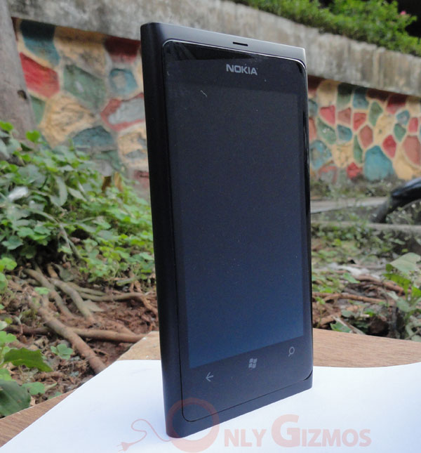
Let’s go ahead and take a closer look at the other aspects of its design. If you take a close look at the front of the device you can see that the call microphone has been placed at the top of the device, other than that the device is beautifully plain.
This is achieved by embedding the light sensor and the proximity sensors right behind the screen. It’s very difficult to spot them with your eyes, and all you can see is the Nokia logo on the top of the screen. Speaking of the screen, the Nokia Lumia has a 3.7 inch ClearBlack AMOLED Display with a resolution of 480×800 pixels. There are three touch buttons i.e. back, home and the search button which takes you to the Bing search engine. It’s supposed to integrate internal search as well in the next Windows Update.
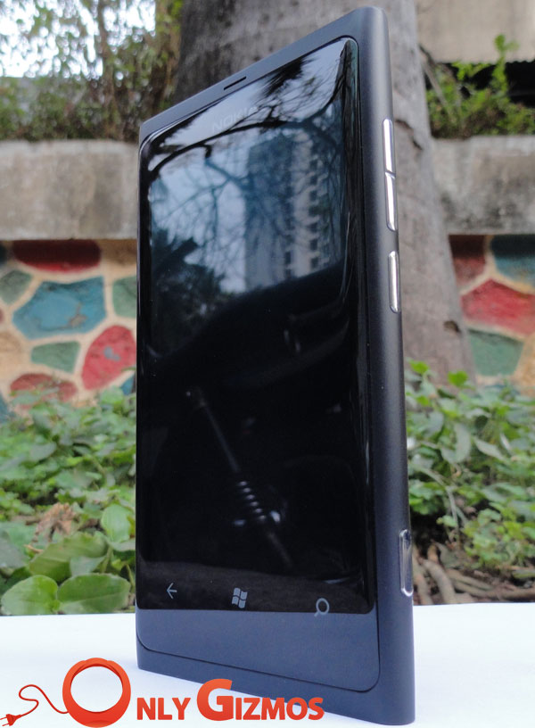
On, the right hand side of the device you have the volume keys, lock / power button and a dedicated camera button. The left side of the device is blank. The bottom of the device houses the speakers and the call microphone.
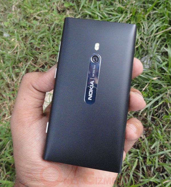
The back of the device houses an 8MP camera with dual LED flash and a Carl Zeiss Tessar Lens. The top of the devices has a 3.5mm audio jack along with a special covering which houses the micro USB and the micro SIM. It’s a bit tricky to open these slots, and we have heard from a few people how they have ended up damaging the covering while trying to open the same.
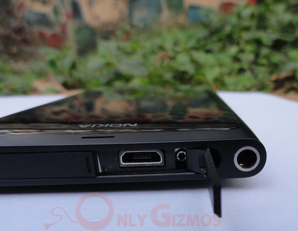
Here, is a short video explaining how you can gain access to these ports without damaging them
Overall the Nokia Lumia 800 boasts of one of the best looking smartphone ever and don’t be embarrassed if you find yourself drooling over it.
We know that the Lumia 800 is more or less very similar to the N9 and borrows a lot from it. Though I think it would be unfair to compare the two and be critical of the hardware on the Lumia 800 as we believe that the internals of the Windows Phone 7 devices are manufactured as per the specifications given by Microsoft.
Performance
TouchScreen
Speaking about the screen, it has a ClearBlack AMOLED display which renders colors beautifully, and I must say that blacks are very black no matter how much you toggle with the brightness of the screen the intensity of the darkness of the black color remains the same. As a result, it improves and enhances the appearance of other colors on the screen.
At 3.7” the screen is sufficiently large enough and watching images and videos on the screen will be a delight. Also, the screen is comfortably large enough to play games on it. Though I must add that it easy to sub consciously hit the back button on the device some times, this happens especially while playing games on the device in the landscape mode.
The other important thing is that the AMOLED screen used here is a slightly cheaper version, called the PenTile Matrix display. Besides being cheaper, this type of screen helps reduce the battery consumption on the device even when at brighter settings. Though, this will not affect your multimedia viewing experience I must add that the readability of texts on the device is not that great.
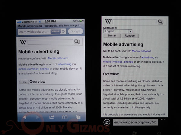
iPhone 4’s Retina Display vs Lumia 800’s Pentile AMOLED Display
In the picture above you can clearly see the difference between the two display. Also if you observe closely, the Pentile Display of the Lumia 800 has a mesh wire effect which might not really please the eBook readers on the device.
Overall view ability of the screen under the sun is good; though it is not as good as say Samsung’s Super AMOLED display or the iPhone’s Retina display.
Camera
Any Nokia flagship device after the Nokia N8 will inadvertently carry some burden of heightened expectations. And here in this case it’s the Nokia Lumia 800 with an 8MP Carl Zeiss Tessar Lens camera equipped with dual LED flash.
The fact that the camera can be launched from the lock screen with the help of a dedicated camera button and the two step exposure and focus option was a promising start. In case you do not want to use the camera button there is an even easier option in the beautiful AMOLED screen which can be used instead to lock on the subject and tap the screen, it will automatically make use of the best possible settings and capture the still for you.
Although the second option is quick and convenient to use, I somehow felt that using the first option gave me better control and results executed correctly.
The myriad of features easily accessible by pressing the ‘wheel’ button at the bottom left brings up a multitude of features ranging from flash to ISO settings.
Though, we didn’t find the results to be that great when compared to other cameras in the market like the 8MP shooter on the SGS II or even the iPhone 4’s 5 MP camera.
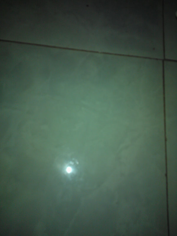
Also, the other interesting thing we noticed is that the images have a bluish / greenish tinge when shot with a whitish background especially aggravated under low light conditions. We expect this bug to be ironed out with the next software update for the Lumia 800.
The video camera can shoot only upto 720p, though the videos have good color saturation. Ideally we would have loved the “zoom” option in the video mode which is missing right now. We hope it to be brought in with the next update. The quality of the video recording on the Lumia 800 is comparable to one on the iPhone 4. It’s just that the ‘auto focus’ on the Lumia 800 gets working a bit slowly and as we mentioned earlier about the blue tinge being visible under low light conditions.
Sample Video
You can see a quick comparison of the cameras in the iPhone 4 and the Lumia 800 under low light conditions in a video below:
Overall the camera on the Lumia 800 is snappy and convenient to use and you will find yourself using it often. Though we would like to see the slow autofocus and the greenish tinge errors rectified before we rate it on par with others in the same league.
Music Player
The music player on the Windows Phone 7 based Lumia 800 is refreshingly different and has a host of features that makes using the music player fun and easy at the same time.
We loved the way there are options to access your collection using ‘history’ and ‘new’ besides the usual ones like artists, albums, genres etc. We know this is not something new but the interface looks beautiful and neat.
Though, we would have ideally loved to have a time scale while scanning through the songs from the lock screen. Also, currently the music player also does not align itself in the landscape mode; we hope this is added, as well.
Speaker
Coming to the speaker on the device the less said the better. Terming it a disappointment will be an understatement. Though it’s not loud we expected it to at least carry some bass. Alas! That is not the case. Even after reaching full volume you almost feel that the speakers probably are not operating at its optimum volume capacity.
Earphones
The earphones bundled with the Lumia 800 more than make up for the disappointment caused by the inbuilt speakers on the phone. They are very loud and behave at higher volumes, as well. It has a near perfect balance of treble and bass. The audiophiles will have no complaints enjoying music on these earphones.
Also, the material used on the earphones helps, making it easier to detangle the earphones out of their usual mess. Though, it’s sad that Nokia did not put control options on the earphones. Being a flagship one would expect them to be present.
Software
The Windows Phone 7 has been appreciated for its Metro UI, which has been labeled as promising by tech experts all over the world. So let us go ahead and check it out.
While iOS gives you a homescreen full of apps and Android serves you with multiple homescreens, widgets and app drawers; the Metro UI presents live tiles, which are refreshingly different and pleasing to the eye at the same time.
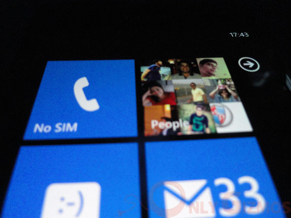
These live tiles can be pinned to the homescreen and each tile is constantly animated and gives you updates as well though it would be just basic like no. of calls, messages etc. Unlike the widgets on Android or lockscreen on iOS 5 which lets you read some part of the tweet or message as well.
The beauty of the platform lies in the fact that it is like one large canvas and you keep navigating across the sheet while scrolling through various windows, instead of going deeper and deeper into the intricate settings like in Android.
There are three standard touch buttons in Windows Phone 7 at the bottom which will help you navigate through the OS, viz back, home and search. Long pressing the back button brings the multi tasking option to the fore, though sadly for now there is the option of accessing the last five apps only. This is certainly not as productive as Android or the iOS, and we hope that Redmond works on this one pretty soon if they are to harbor any hopes of competing with the other platforms in the market.
The presence of Facebook and Twitter integration works very well and amplifies the beauty of, especially the ME and the People tile, making these the most interactive and productive social media widget across any platform.
Also, we loved the SkyDrive integration which throws in 25GB of free cloud storage, which can be accessed through a Hotmail or Live ID.
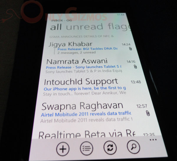
The Windows Phone 7 looks good on the productivity front as well, with syncing of calendars and contacts from your emails and social media sites. Setting up email accounts is also a breeze and options to dig in your folders, view threaded emails, combining all the inboxes are just some of the many email features you will find more than handy. And did we say that we love the fonts on the Windows Phone 7, it makes our reading experience a lot better and I actually enjoy it.
While setting up the phone the initial email account is a primary account which cannot be deleted or changed later on is a major letdown especially if you want to use a different account to purchase apps from the marketplace. And all you can do to change that is reset the phone, which I must add is very sad.
The integration of MS Office, Note and Sharepoint makes it a promising device for the business users as well. And Microsoft should use it to their advantage when competing with iOS and Android.
Talking of apps, this is where the fact that Windows Phone 7 is a developing platform is distinctly visible with apps like Facebook and Twitter being a mere shadow of what they are on the iOS and Android platforms. Redmond needs to work on third party apps, more on the quality front than the quantity itself.
WP7 is a work in progress platform and the guys at Redmond need to strive hard towards building an ecosystem around this platform.
Speaking of Nokia Lumia 800, Nokia has put in its effort to customize the phone to make it a bit more appealing than other Windows Phone offerings in the market. The addition of Nokia Drive, Nokia Maps and Nokia Music is a nice addition which elevates the appeal of the device though yet does not make it distinctively better than the rest in the market.
Nokia Drive is one of the best GPS navigation apps yet in the market. Though, it’s a shame that Nokia Drive and Nokia Maps cannot be used in conjunction and are disconnected from each other.
Nokia also has an app called App Highlights which chooses the best and popular apps from the market place. Nokia’s commitment to the Windows Phone platform is visible from the efforts they have put in by going that extra yard and building apps like TuneIn Radio, WRC Live etc.
Video Review
Battery Life
We decided to speak on this separately and highlight the same because we believe that the battery is a very important feature on the smartphones these days. Though you always expect Nokia to deliver unmatched performance when it comes to battery life, this is exactly where it falters when it comes to the Nokia Lumia 800.
We found our device to be draining battery power and going to cipher in no time. At the most we could only get out 4-5 hrs of battery life while using social media on the device and a bit of music which is fairly disappointing. When used in a very conservative mode all we could get was 12 hrs.
There seems to be a serious issue with the battery performance, which Nokia recently accepted and blamed on a software glitch. Though after running the prescribed tests by Nokia we found that our device was not suffering from a software glitch and that leaves us concerned.
Verdict
Well, there is no doubt that the Nokia Lumia 800 has one of the classiest yet jazzy looking designs, one of the best we have seen so far. And when you consider the beautiful and eye pleasing Metro UI, you are bound to feel that the Lumia 800 and the WP7 are made for each other.
The simplicity of the UI combined with the customizations made by Nokia indeed makes it a compelling device to chose when buying a Windows Phone 7. Though there are some bugs with the camera and the battery that we would like Microsoft to iron out.
There is no front camera on the device which makes the hardware almost redundant for future updates, which would bring in Skype integration, though not be a big deal when you consider the Indian market.
The Nokia Lumia 800 right now seems ideal for the ones who are graduating from feature phones to the smartphones or avid social media users. It’s certainly not the right choice for power users with the unavailability of quality third party apps and games.
Even more importantly, at Rs. 28,000 we feel that the Nokia Lumia is slightly overpriced and would love to see the price slide little southwards, closer to the 20k mark before recommending it to you. For now we feel that the Nokia Lumia 710 priced around Rs. 16,ooo might just prove to a better deal.

