The times they are a changin’. After revealing its Windows Phone 7 strategy for the year 2011, Nokia CEO Stephen Elop seems to be on a mission to change the brand perception and image of his company. The good old Nokia logo seems to be under threat of being phased out and the company seems to be on the verge of announcing a slimmed, toned down and much more sophisticated logo for Nokia.
The outgoing Nokia has tremendous brand recall, a fact that the company might surely have considered before making this move. The company has detailed 800 page explanation on why the old logo needs to go. Now that’s one study we cannot possibly cannot dispute.
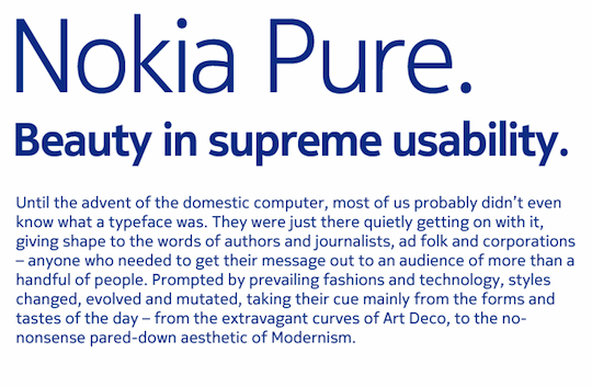
The Nokia “Pure” font according Nokia is described as the embodiment of “beauty in supreme usability.”
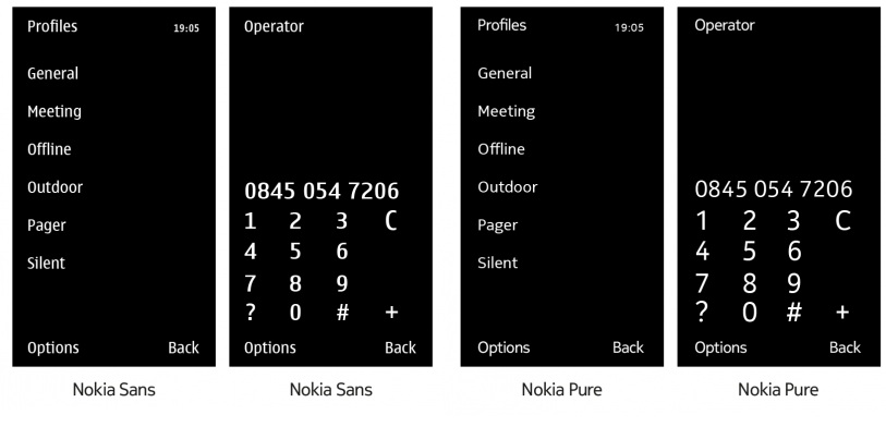
The new font will also make its way to phones from the company. Here’s a comparison of the old font vs the new one on phones.
What do you think about this new Logo?