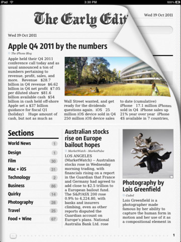
One of the best news apps for the iPad got better. Significantly. We check out the second coming of The Early Edition.There are those who think that the iPad is all about specs – they normally move to Android tablets (another story, another story). And there are those who know that the real magic of Apple’s uber tablet are the apps that run on it, making the most of the display. One of the first apps that really showed what made the iPad special was The Early Edition, which added a whole new spin to RSS feeds by serving them up in the form of a flippable newspaper on the iPad. Well, it has now got a new version. And boy, it has not been given HALF a makeover.
The first thing that is going to hit you when you download and run The Early Edition 2 on your iPad – it costs $4.99 and tips the scales at a lightweight-for-iPad 13.7 MB – is that it has moved from looking like a newspaper to a magazine. While the previous version of the app was more text-heavy, this one has images and even videos sprinkled liberally throughout it. You can opt to get your feeds from Google Reader or set up your own feeds depending on your preferences – the app comes with several preselected to get you going right away.
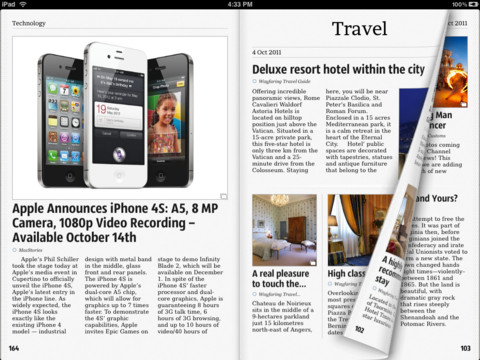
The real fun, however, begins when you start using the app. For it is then that you notice all the little nuances and touches that the developers have put into what was already a pretty formidable app. There are no buttons AT ALL on the news pages, so you can really focus on reading. To access the menu, just pull down the top of the app (it takes a bit of getting used to, as thanks to iOS 5, the top of the iPad also houses a notification bar, but you will soon get the hang of it). Page turns now follow your finger, allowing you to languorously turn a page, although flipping it with just a touch is possible too. There are animations too – tapping on a story now sees it revolve out of its smaller version, while clicking on the feed sections button sees them being arranged neatly like a stack of library cards, one below the other.
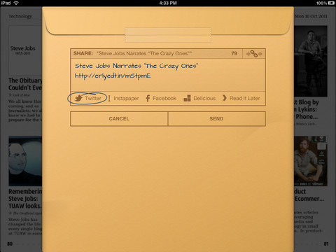
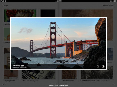
There are other neat graphical touches too. When you wish to share a story (you can choose Twitter, Instapaper, Facebook, Delicious and Read It Later), out pops a brown envelop-like page, complete with a cellotaped back. And if you are one who loves ogling at images, well, just double tap on an image in the main page view and it floats out, letting you look at it in isolation. What’s more, you can flick through different images from the same story in this “gallery view” or simply go through images from different stories. Now, if that is not coolness, we need a new dictionary.
But the best thing of all is that beneath all these bells and whistles (they are gorgeous but they ARE bells and whistles), The Early Edition 2 remains the same rock-solid app that its first avatar was. You can actually sync all your stories – images and all – switch off your Wi-Fi/3G connection and sit down and do some very serious offline reading too.
Yes, there are a few quirks – the app crashed on us a few times, especially after we had added new feeds to it, and sometimes adding new feeds takes a bit of doing. But for most of the time, The Early Edition 2 converts your iPad into a super news magazine reader – and joy of joys, it works as well on the older iPad as it does on the iPad 2. Which is why we recommend you spend $4.99 and go grab it.
Get it from: iTunes App Store
Price: $4.99

